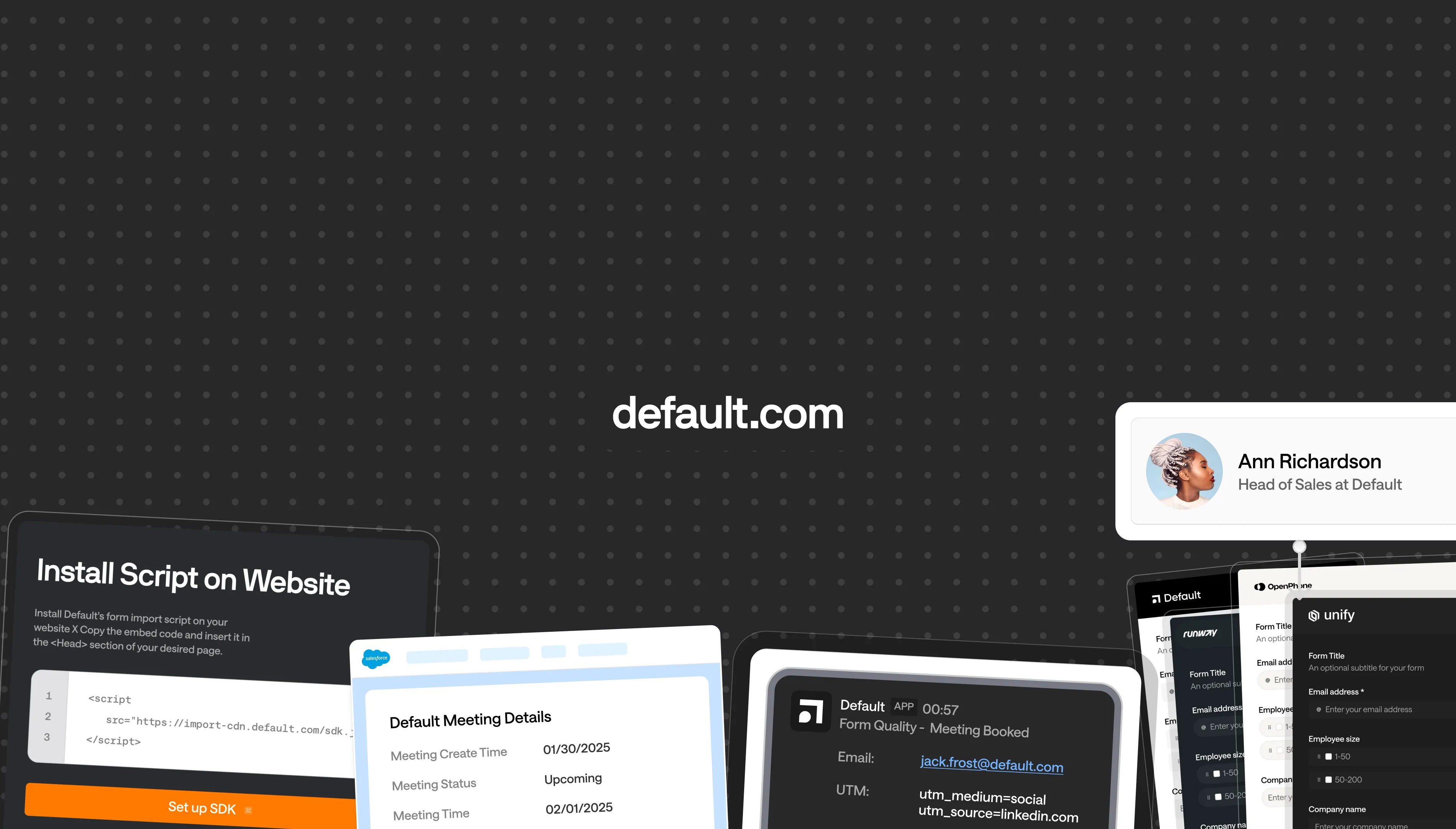
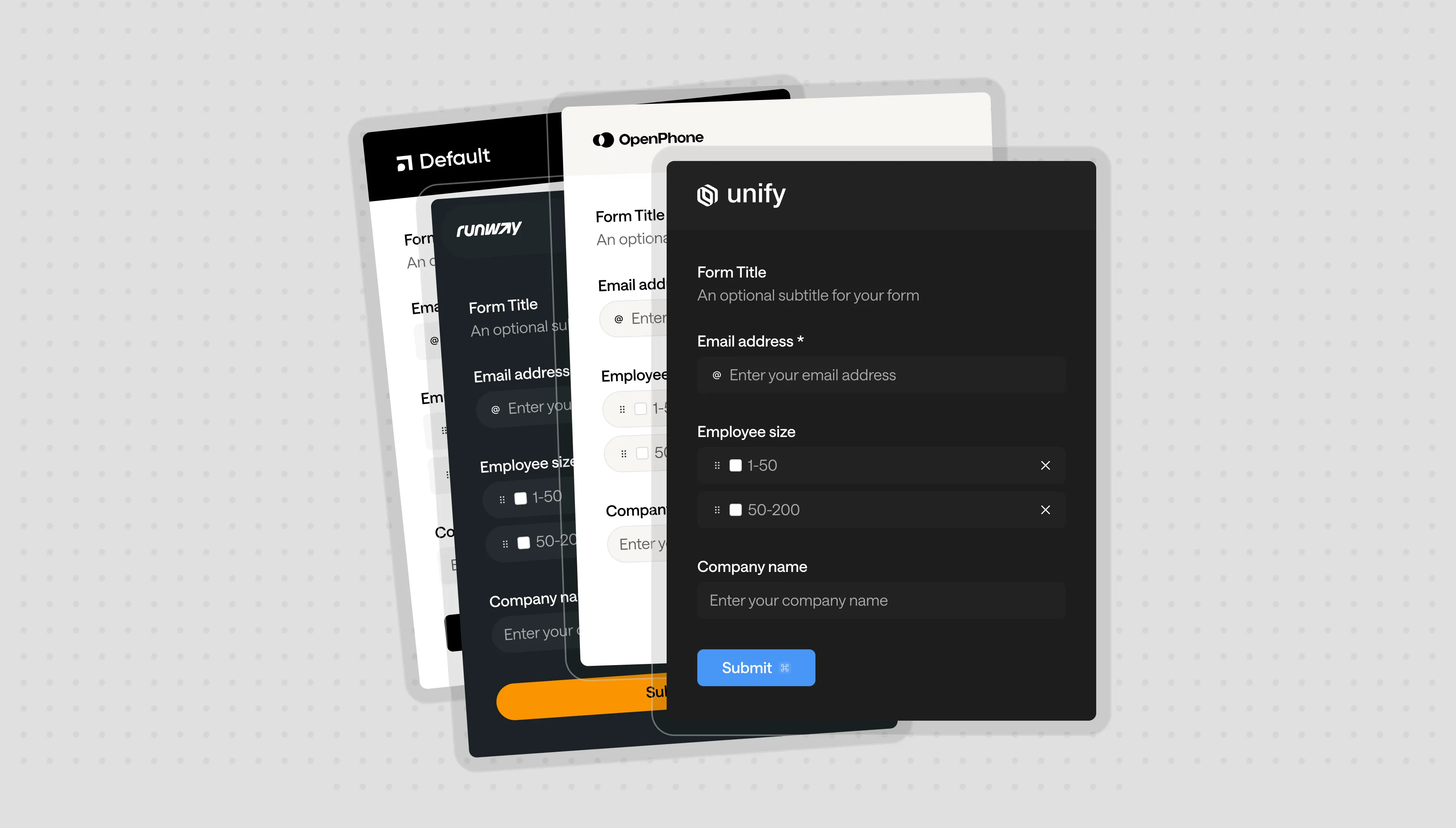
Default is the inbound orchestration platform for revenue teams. Their client list is stacked with some of the fastest growing B2B startips like Amplemarket, Runway, OpenPhone, Bland.
With Default, we connected with the common goal to reposition the company for their 2.0 launch. That means a refreshed identity, new website design, improved product messaging, and development + content migration. The timeline was tight [8 weeks] and the task was quite heavy.
With Default, we connected with the common goal to reposition the company for their 2.0 launch. That means a refreshed identity, new website design, improved product messaging, and development + content migration. The timeline was tight [8 weeks] and the task was quite heavy.
What we did
Design
Core Brand, Strategy, Imagery, Responsive Design, Product Visualization
Development
Webflow Implementation, CMS, Training
Strategy
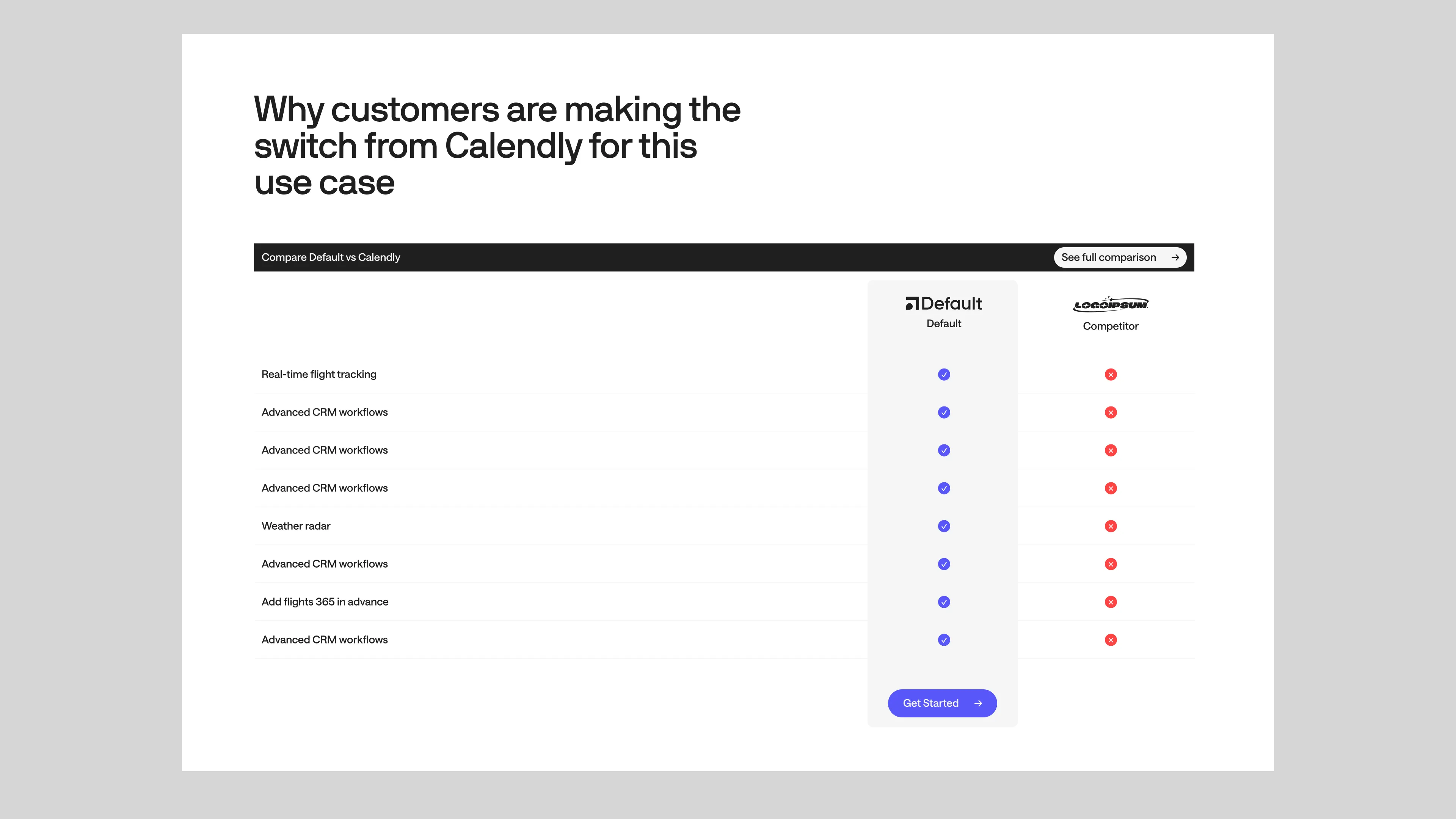
The old Default site was converting quite well. Their solution pages drove a great amount of traffic, workflow templates and reports captured new leads, and case studies helped brand image. So we definitely wanted to retain those pieces.
However, after auditing their website, we found a couple key issues:
However, after auditing their website, we found a couple key issues:
Weak Product Education
Product Education is describing features, showing people how core flows work, and visually explaining the product in context to real customers. None of that was happening on the older site.
Underselling Solution Pages: Big Missed Opportunity
Solution Pages were reusing the same copy and imagery; wasting opportunity to really showcase how a particular industry would benefit from Default. Generic copy and structure was missing out on key conversions from ads, weakening their funnels.
A lack of site-wide linking.
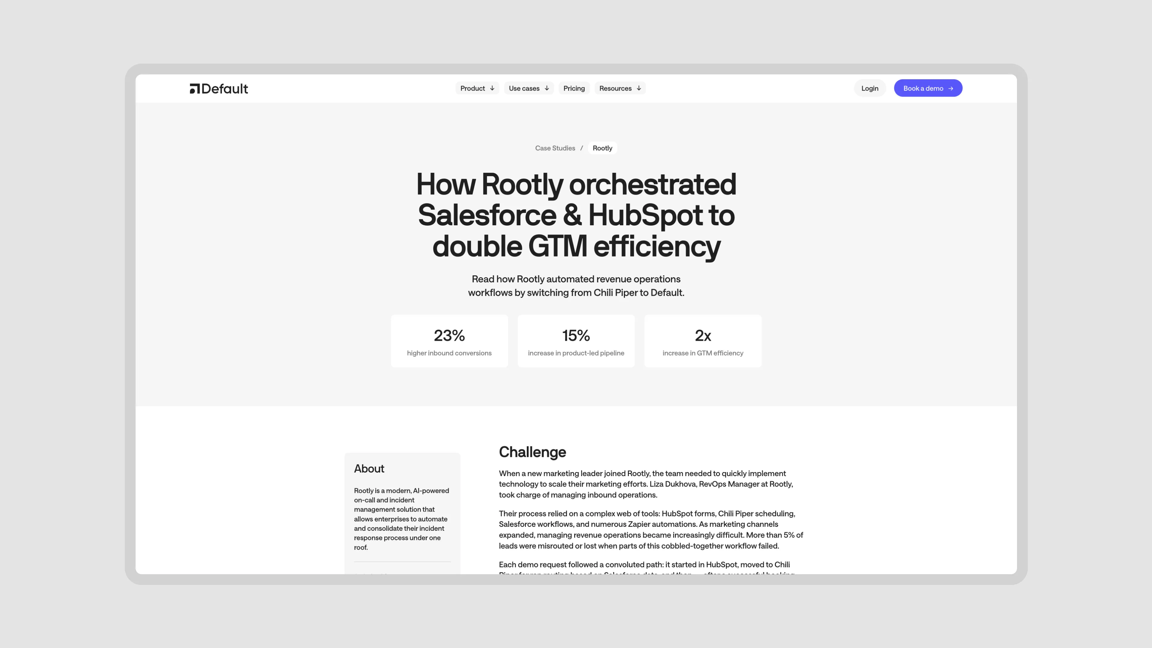
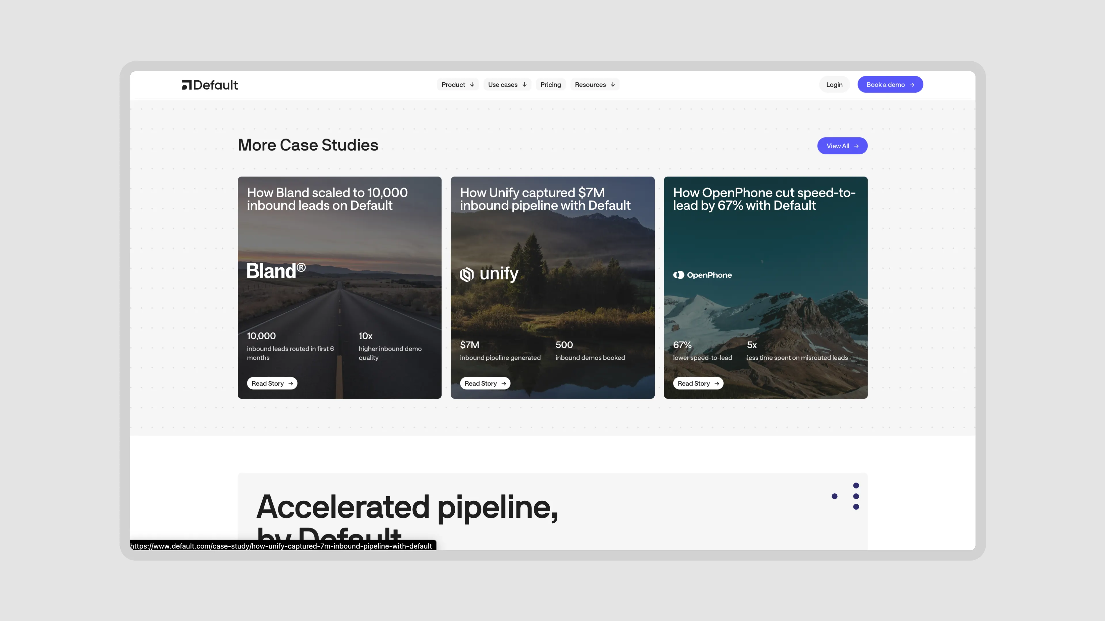
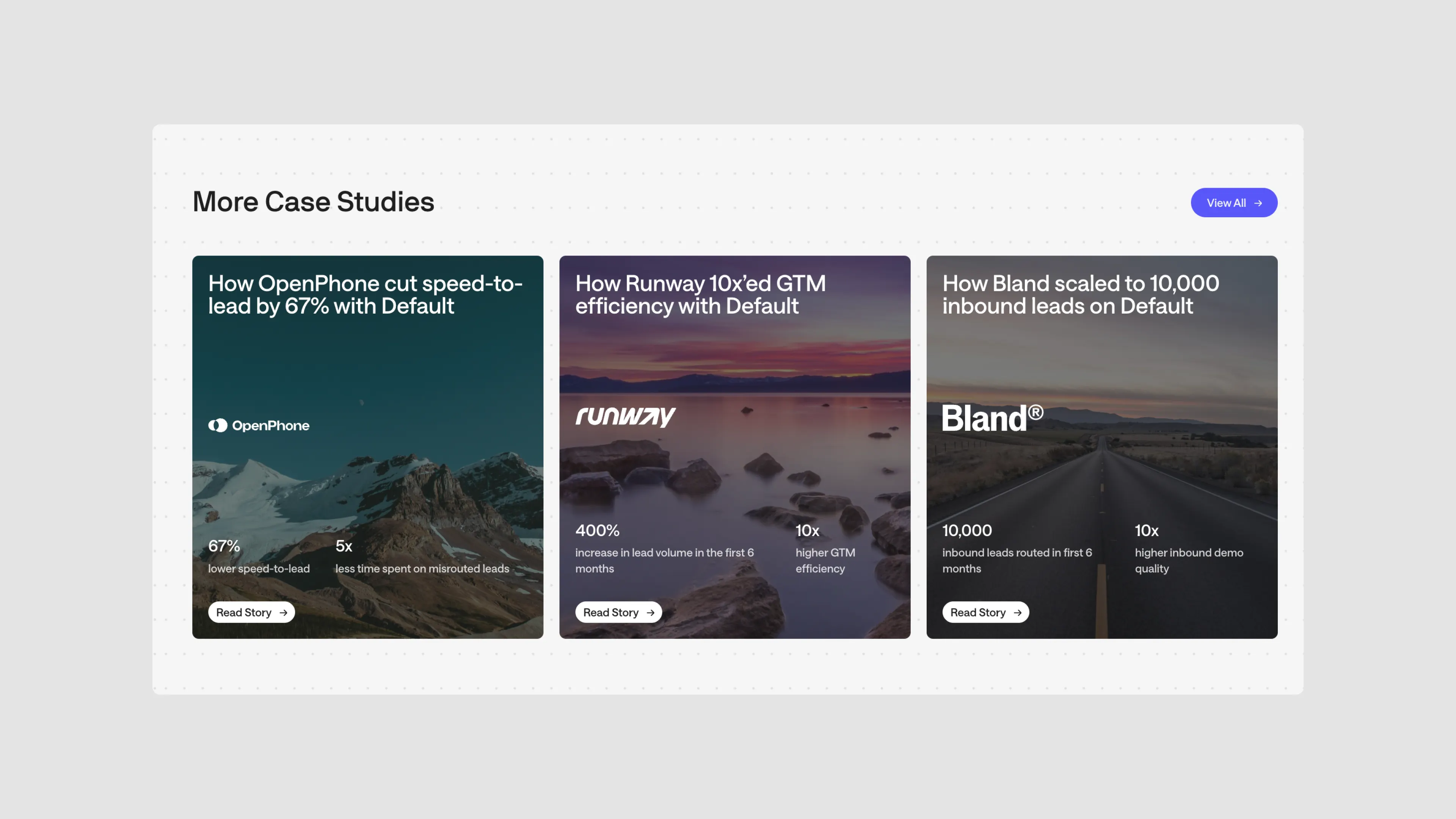
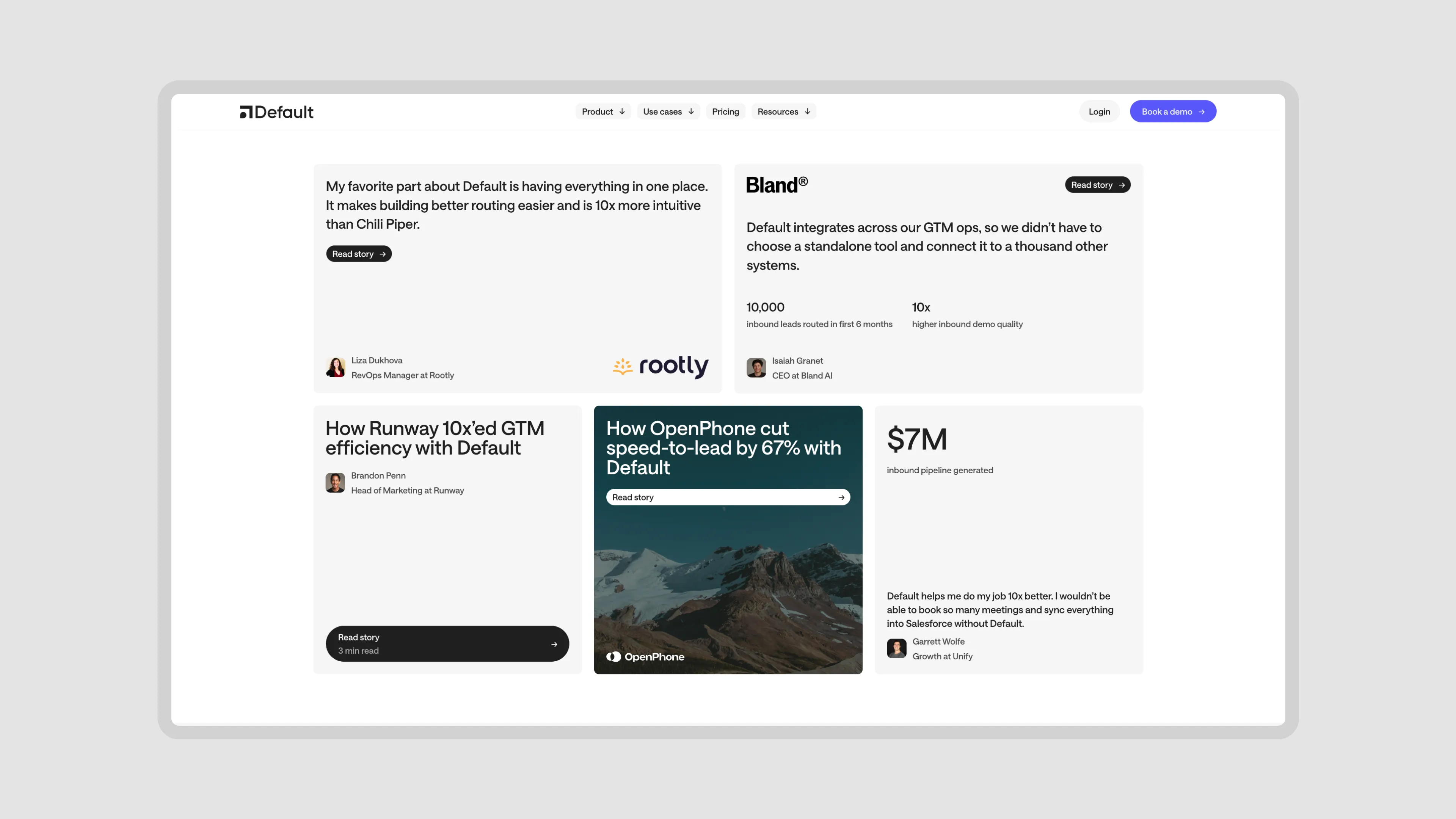
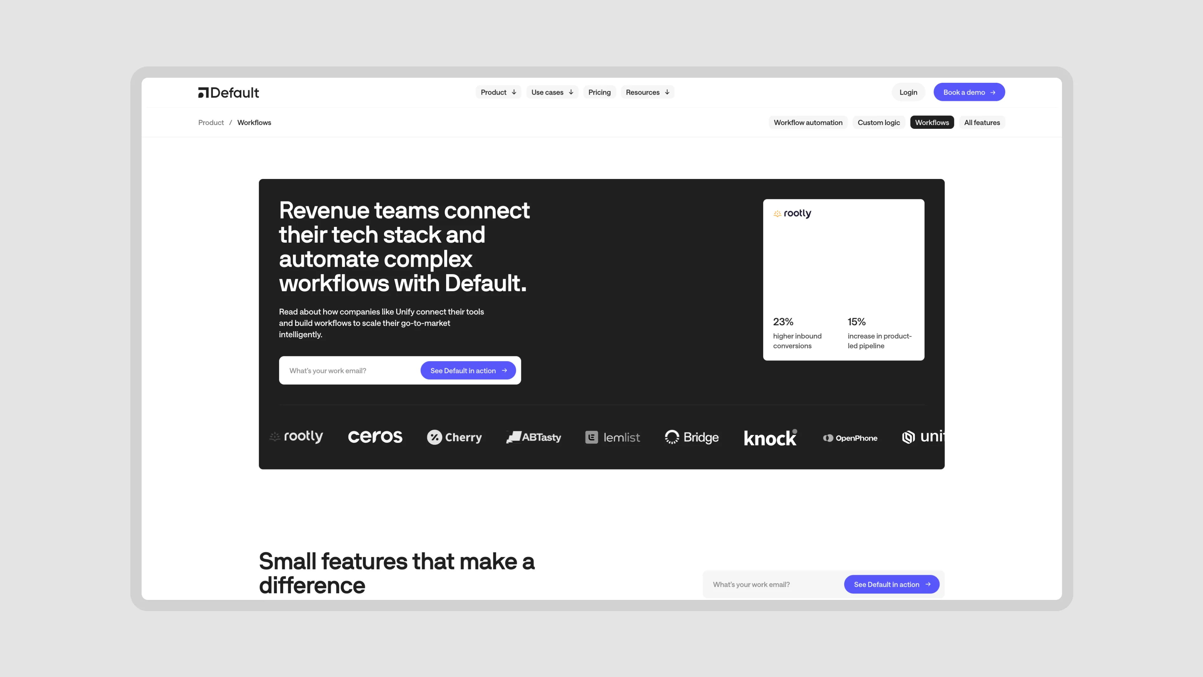
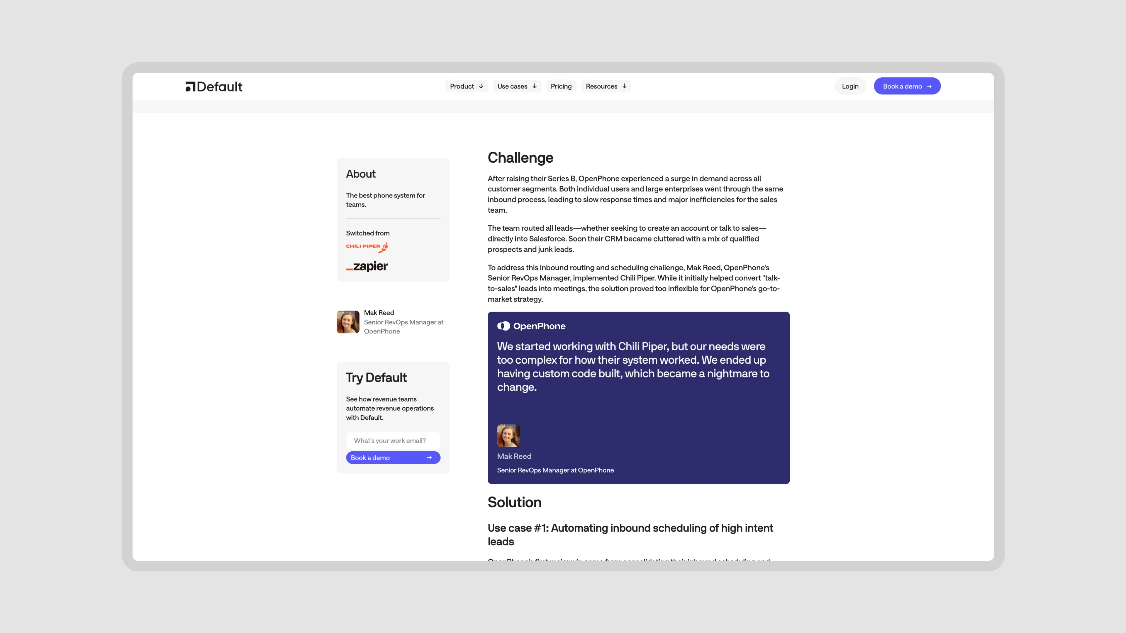
Default had some really strong case studies and customer stories of people actually using core products to drive more revenue, book more calls, etc. Real tangible benefits.
But there was little to no effort on bringing those powerful statistics onto the website. You had to almost go out of your way to find these case studies. On top of that, the case studies were part of the blog CMS making discoverability much harder.
But there was little to no effort on bringing those powerful statistics onto the website. You had to almost go out of your way to find these case studies. On top of that, the case studies were part of the blog CMS making discoverability much harder.
Poor Design.
There was obviously a lack of visual coherency, inconsistent spacing, and other design faults on the website / brand, but the ones above were some of the core goals to fix on this website. Fixing them would instantly + drastically improve the quality of the website. So, put those goals on our maps and set out to work on the sitemap.
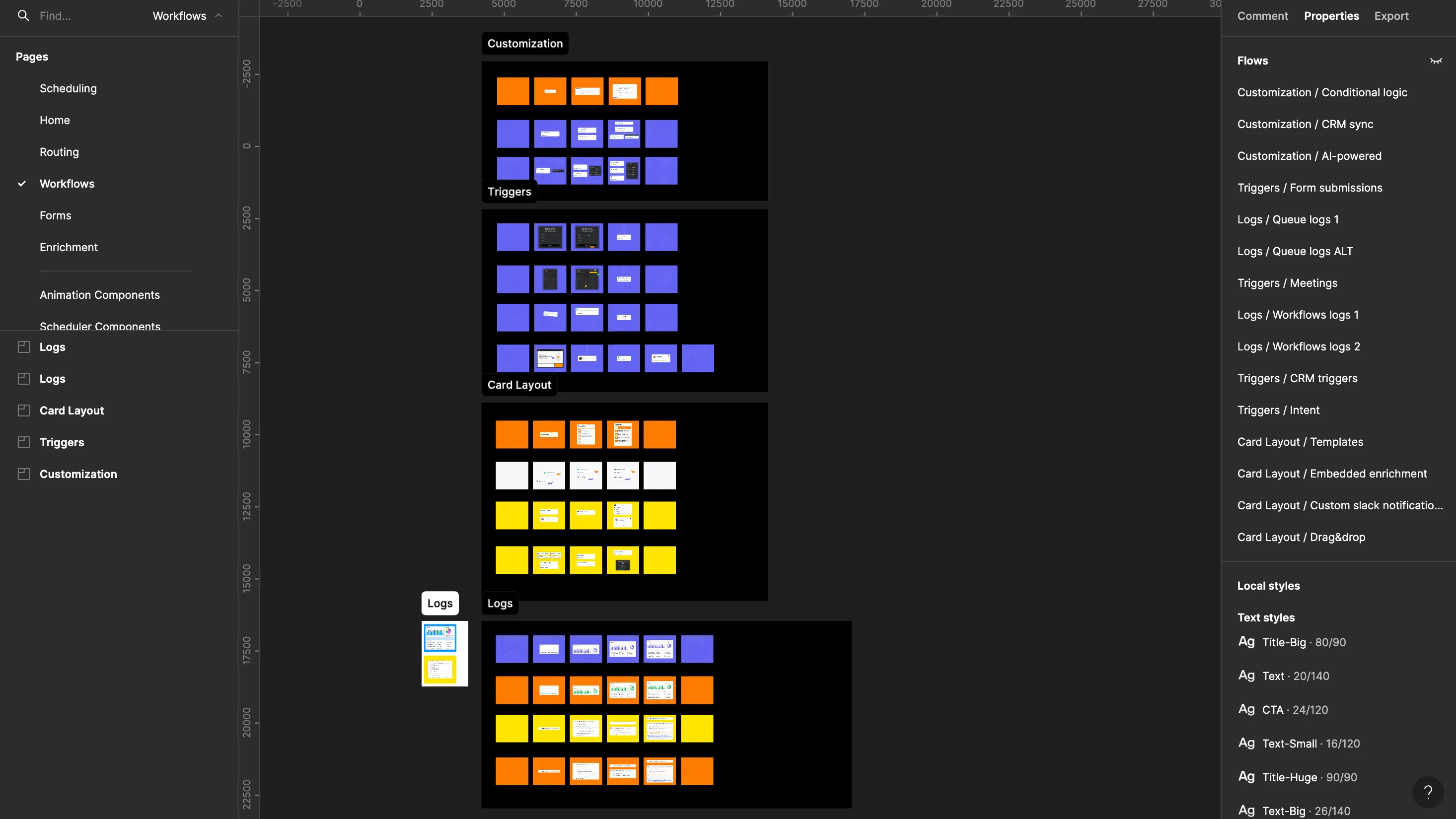
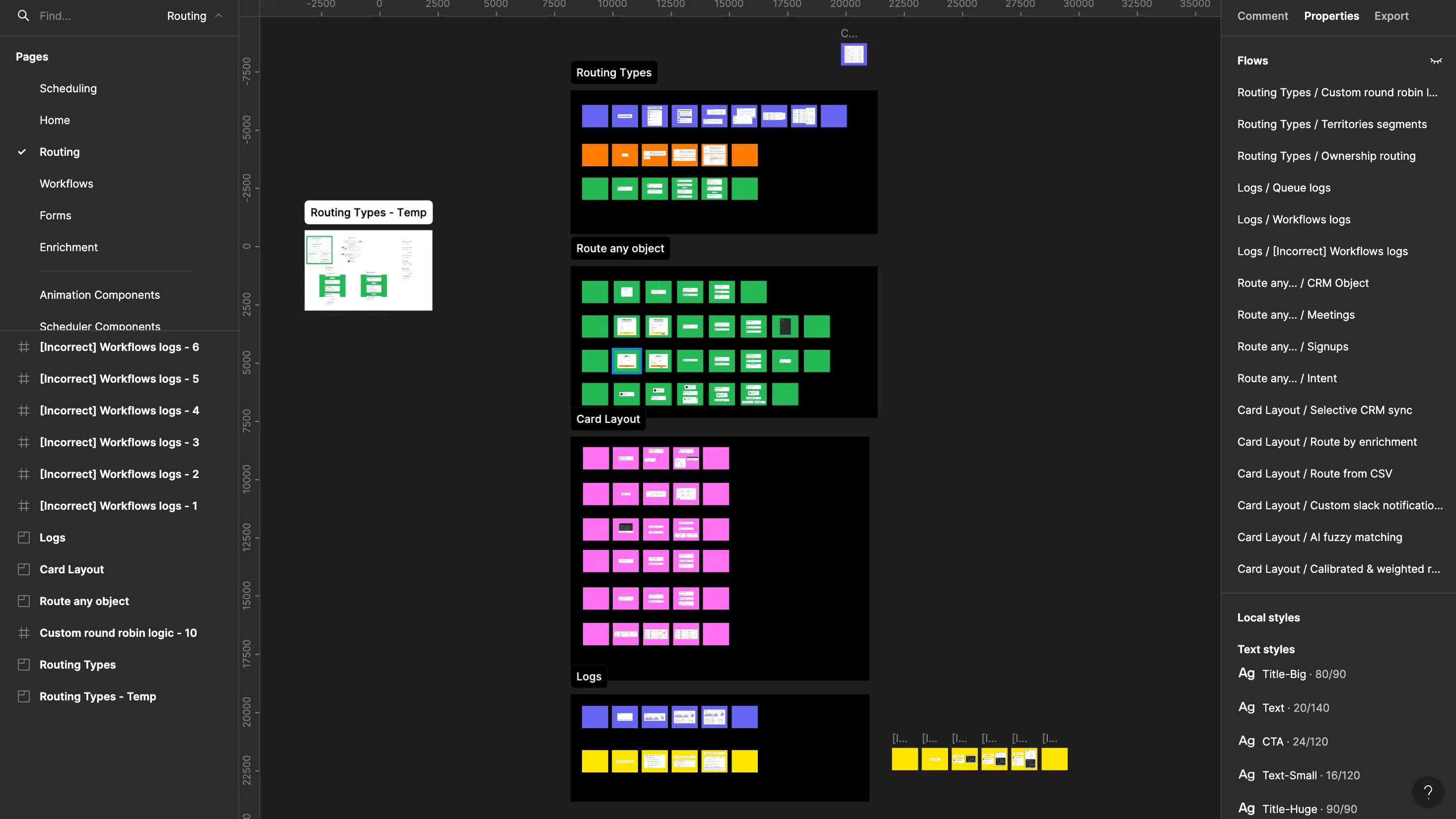
Sitemap
This was laying out all of the content and pages they currently had, the pages they wanted to add, and the pages that no longer felt relevant and important + should be removed.
We also made a note to double down on the core items mentioned before — Solution Pages, Case Studies / Statistics, Workflow Templates, Reports. We also marked the sections of all the pages into Dynamic, Static, and Template (repeatable) content.
We also made a note to double down on the core items mentioned before — Solution Pages, Case Studies / Statistics, Workflow Templates, Reports. We also marked the sections of all the pages into Dynamic, Static, and Template (repeatable) content.
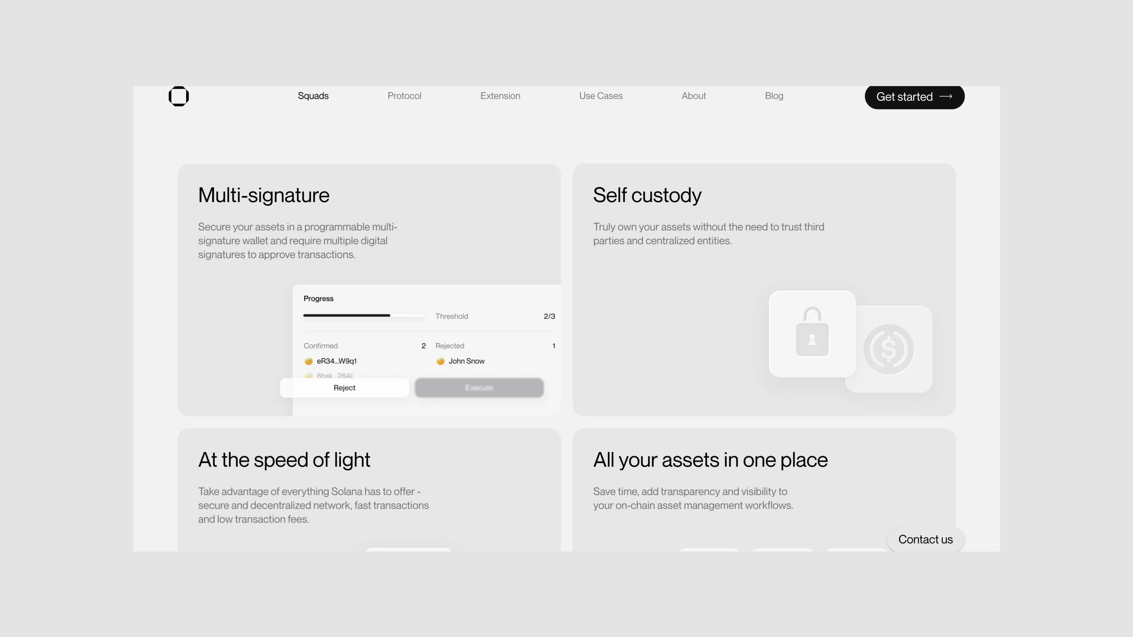
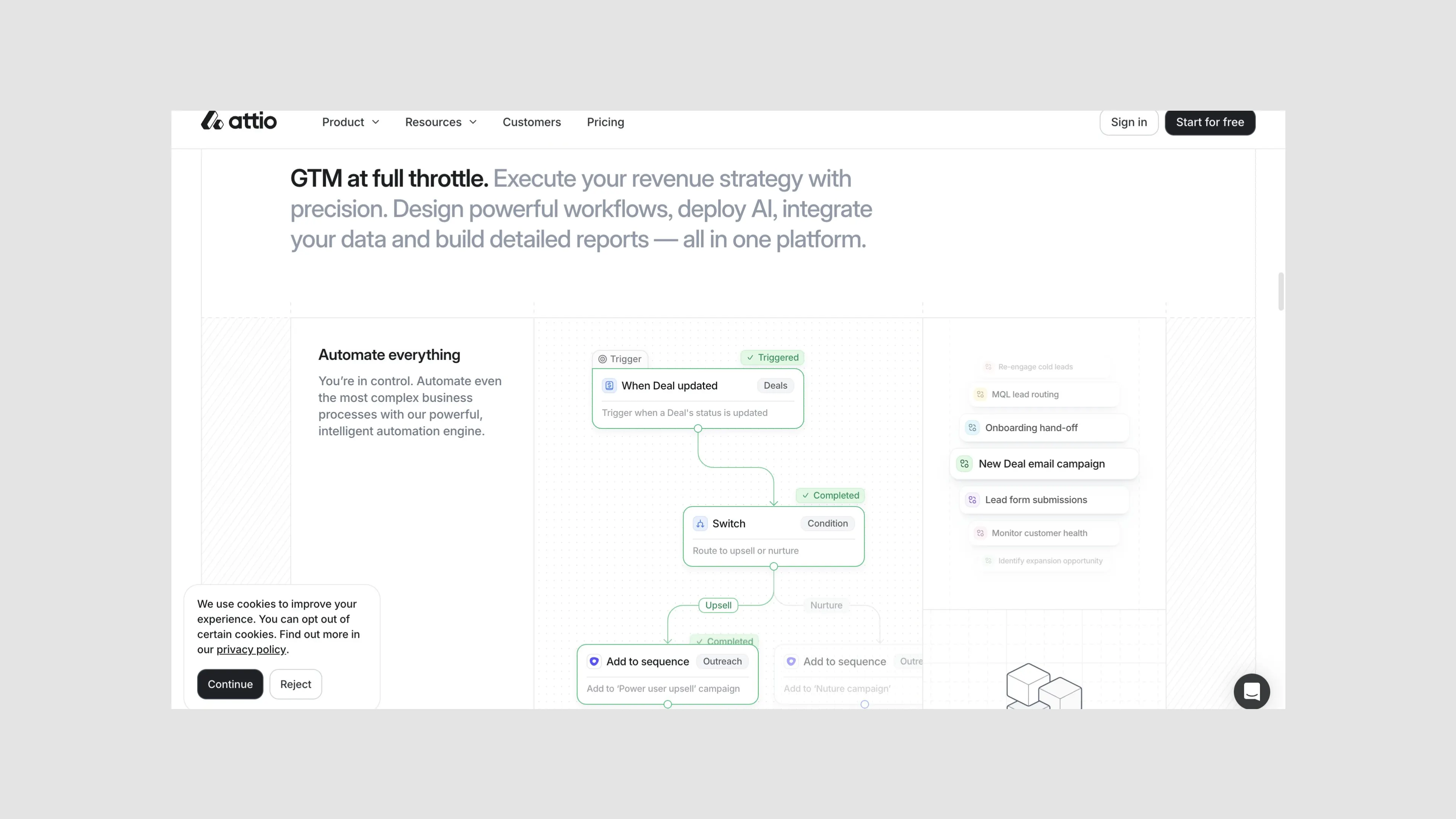
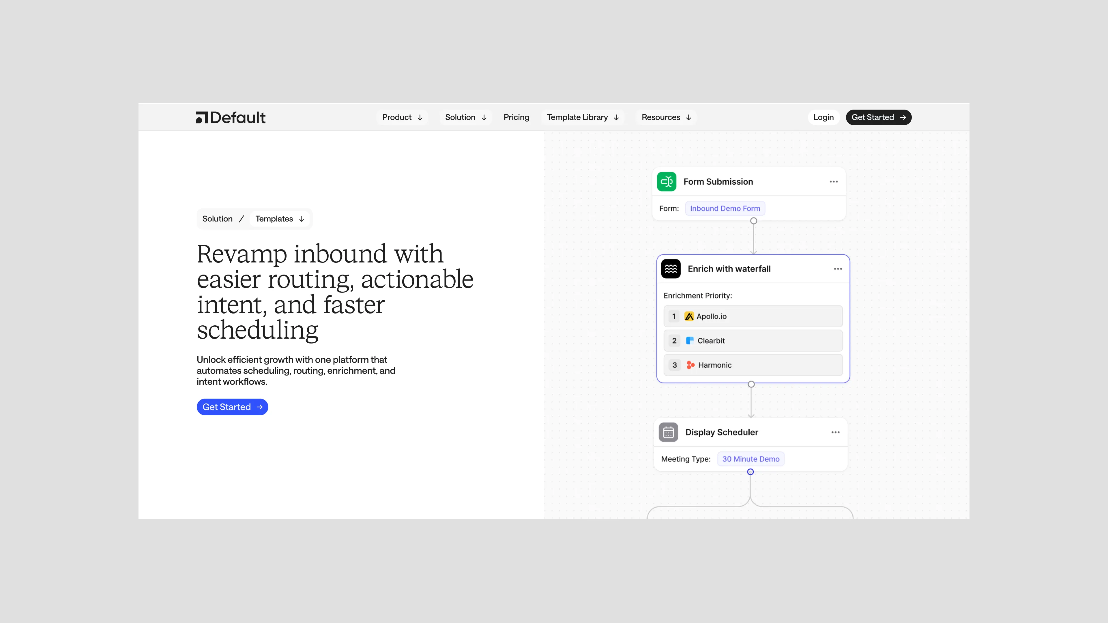
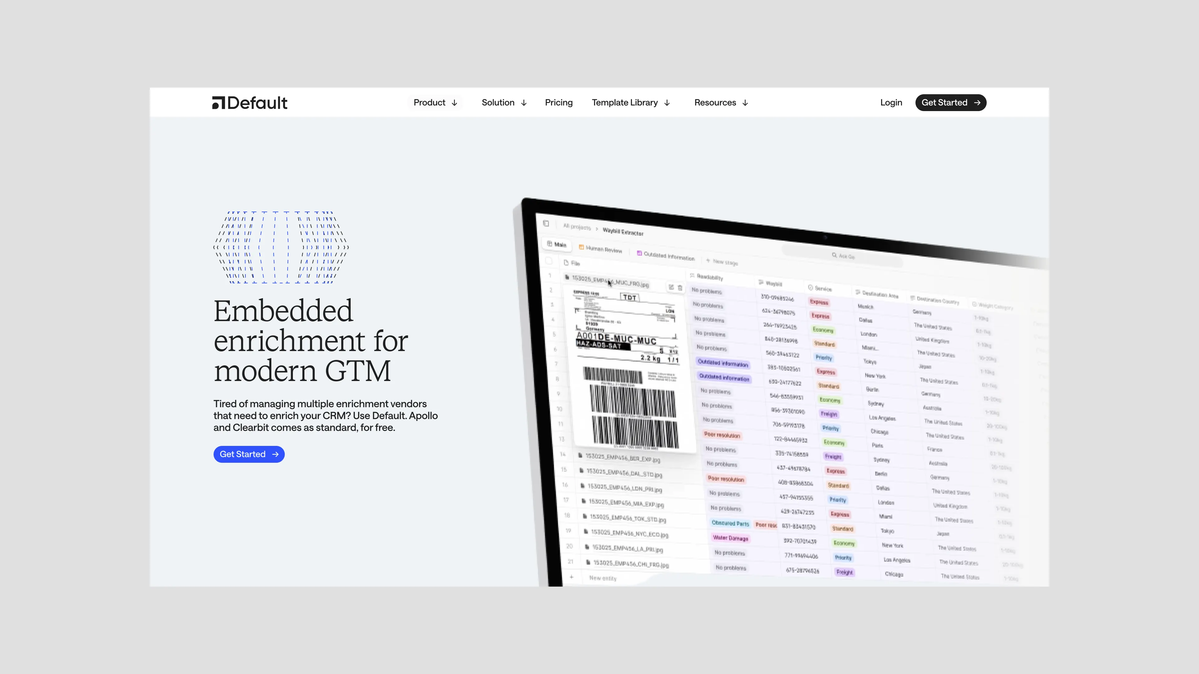
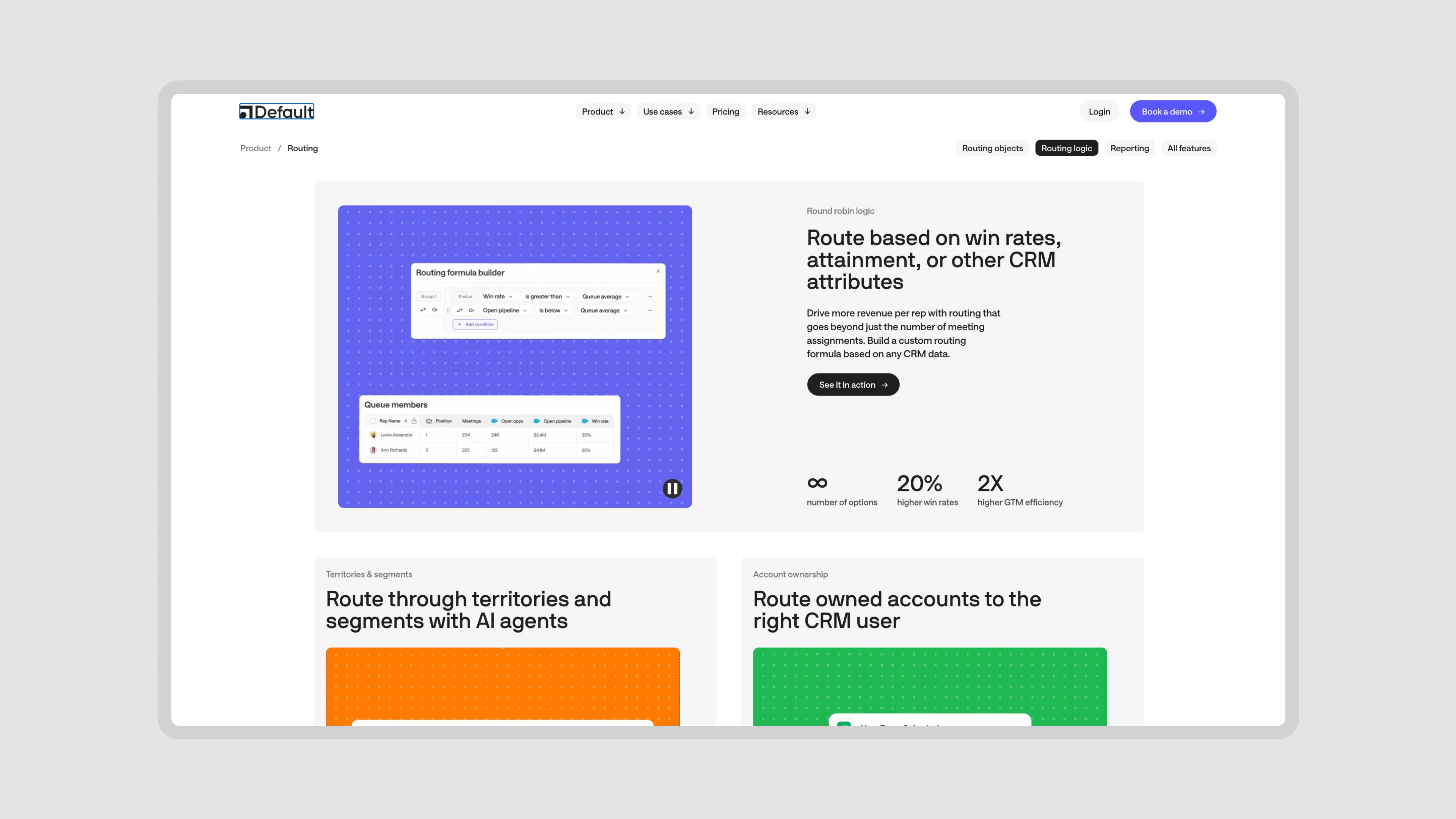
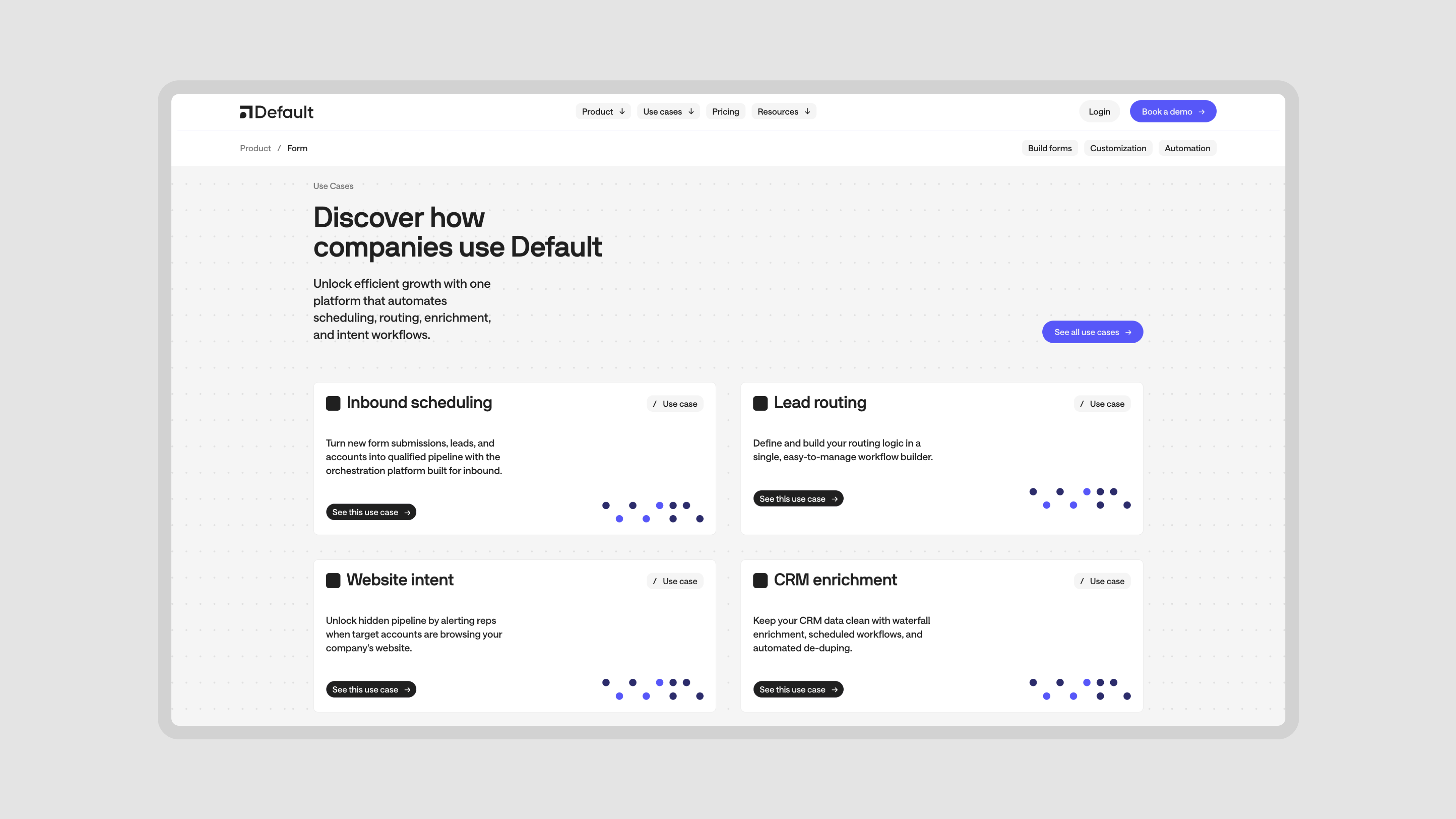
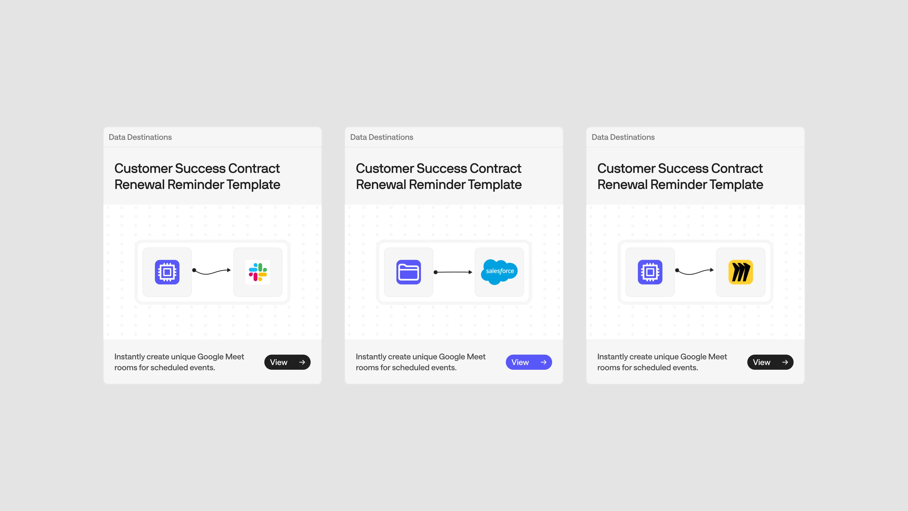
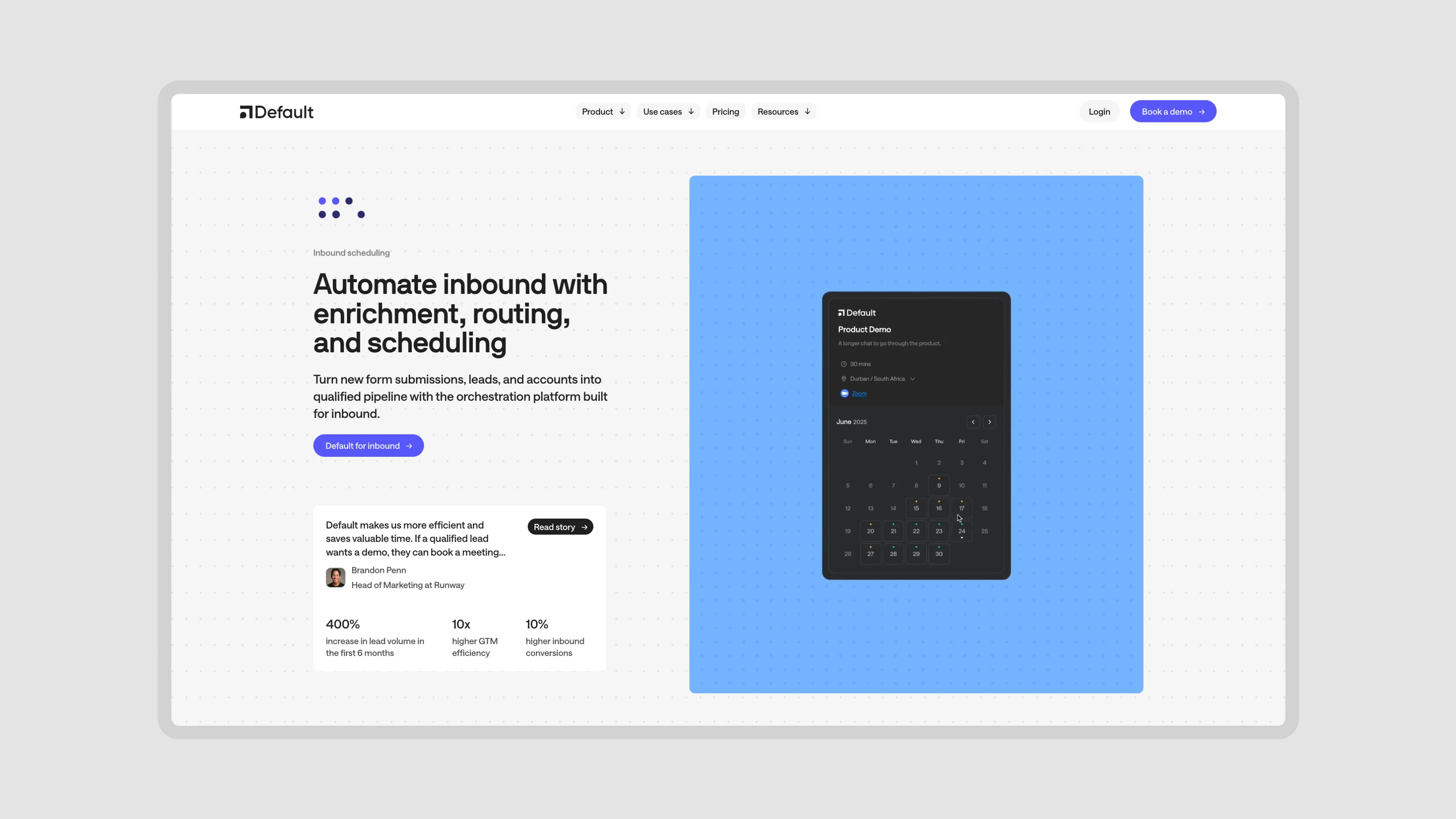
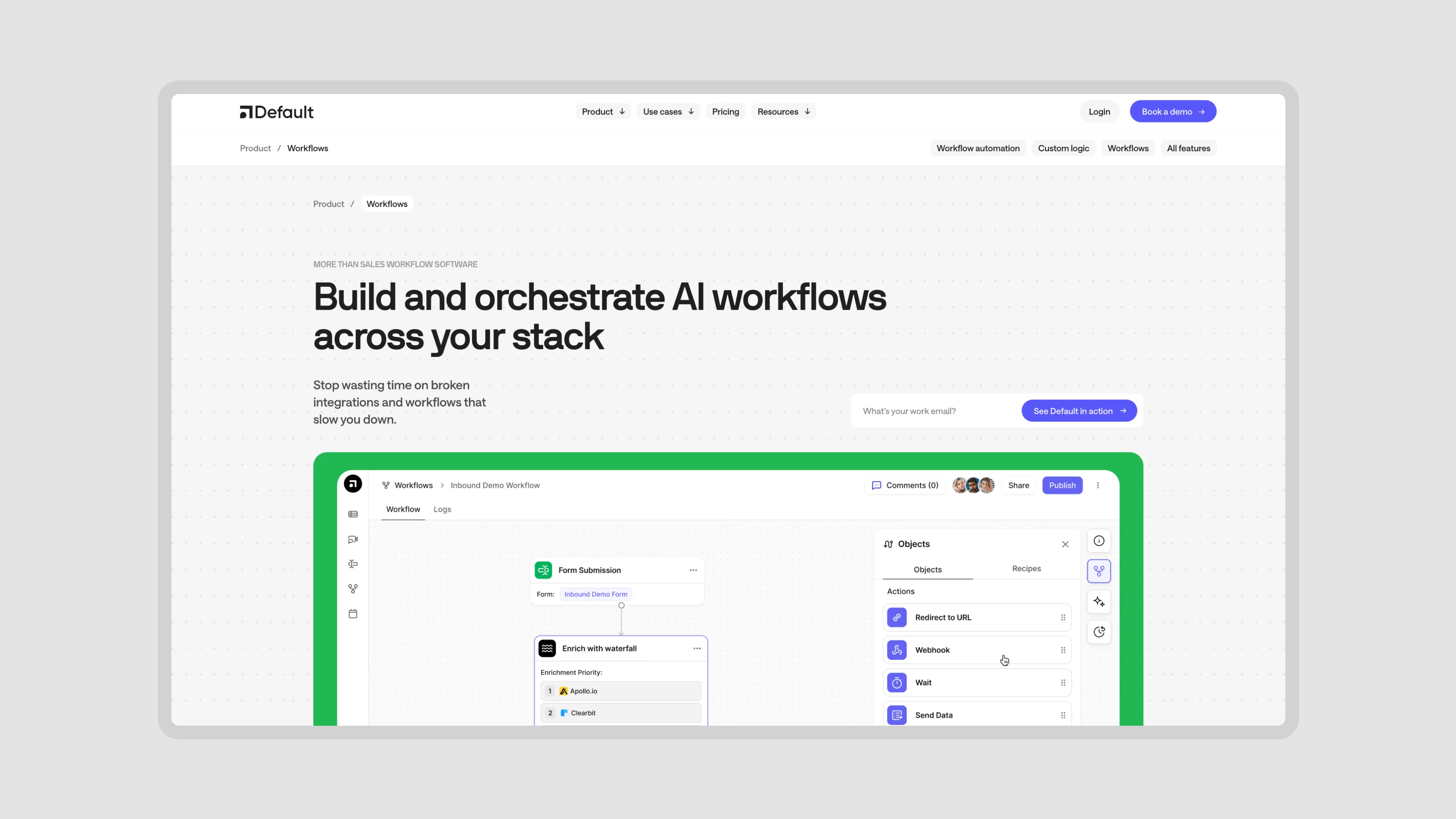
Core Product
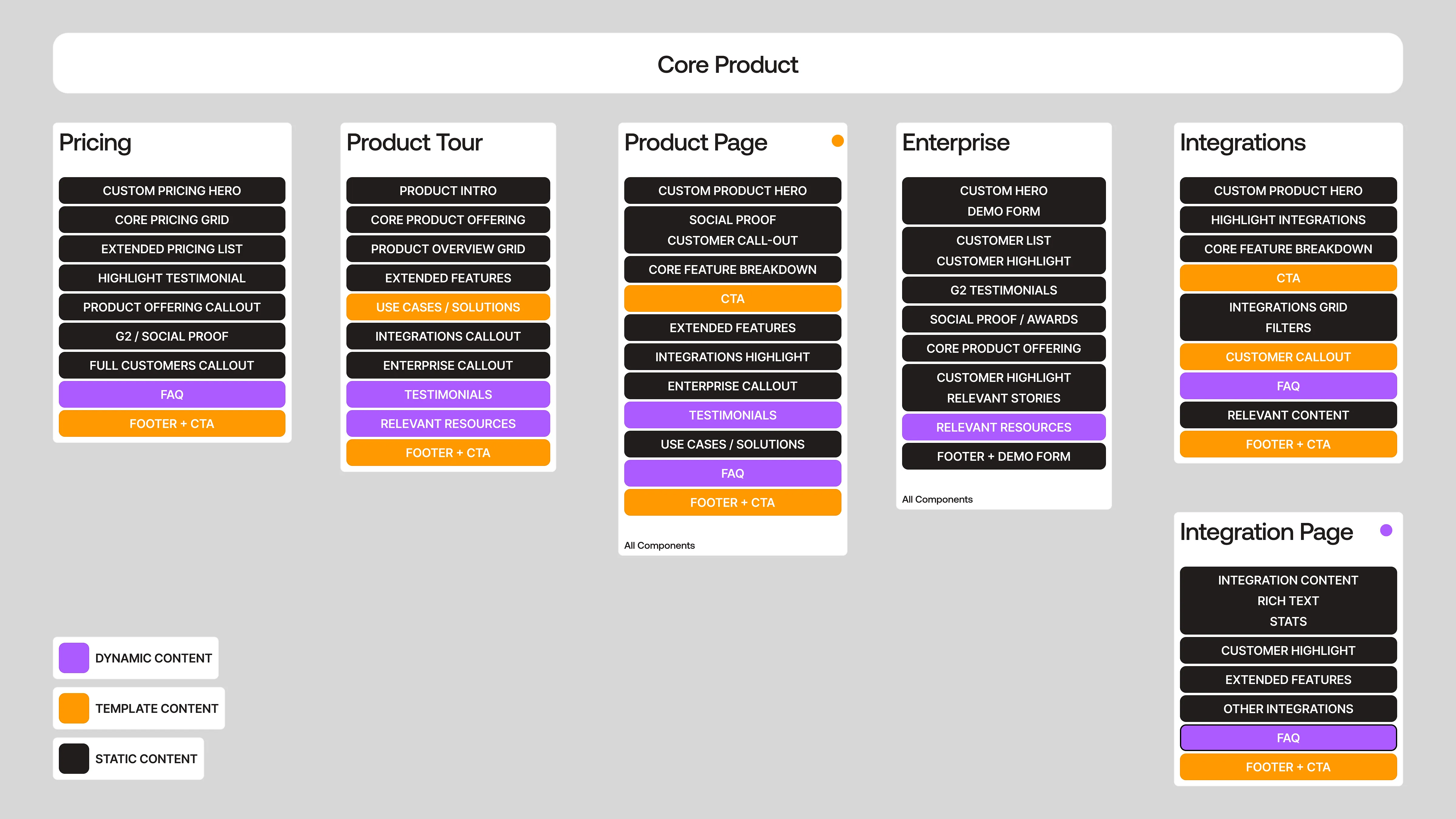
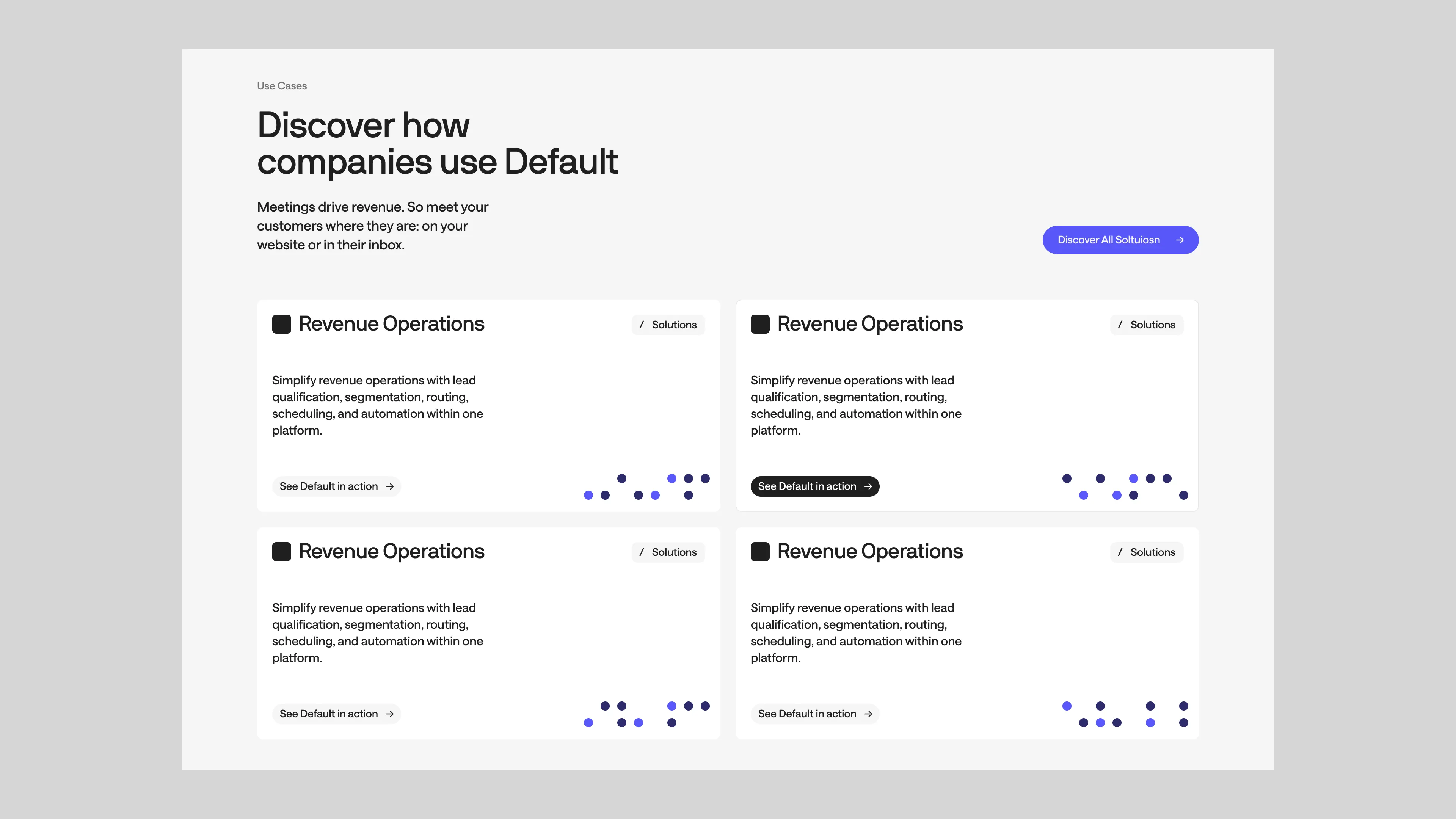
The first and the biggest piece of this sitemap was the Core Product, which was meant to highlight product education and defining features and how they work + can be set up + used. You’ll also notice a lot of callouts. That’s our opportunity to cross link.
For example: A Product Page with an Integrations Callout can drive traffic to a list of Integrations while also highlighting 3–4 Integrations relevant to that product. Then the Integration Page can link to a custom Workflow you can build with it, which further drives users into the Workflow CMS and learning about all the things you can do with Default’s Workflow Templates. With Case Studies relevantly positioned across all of that content, users can now check out real customers who use those Workflows and the direct benefits they’ve gained from them. Across that entire flow, there are callouts to the Demo Form, so there’s no missed opportunity to convert.
For example: A Product Page with an Integrations Callout can drive traffic to a list of Integrations while also highlighting 3–4 Integrations relevant to that product. Then the Integration Page can link to a custom Workflow you can build with it, which further drives users into the Workflow CMS and learning about all the things you can do with Default’s Workflow Templates. With Case Studies relevantly positioned across all of that content, users can now check out real customers who use those Workflows and the direct benefits they’ve gained from them. Across that entire flow, there are callouts to the Demo Form, so there’s no missed opportunity to convert.
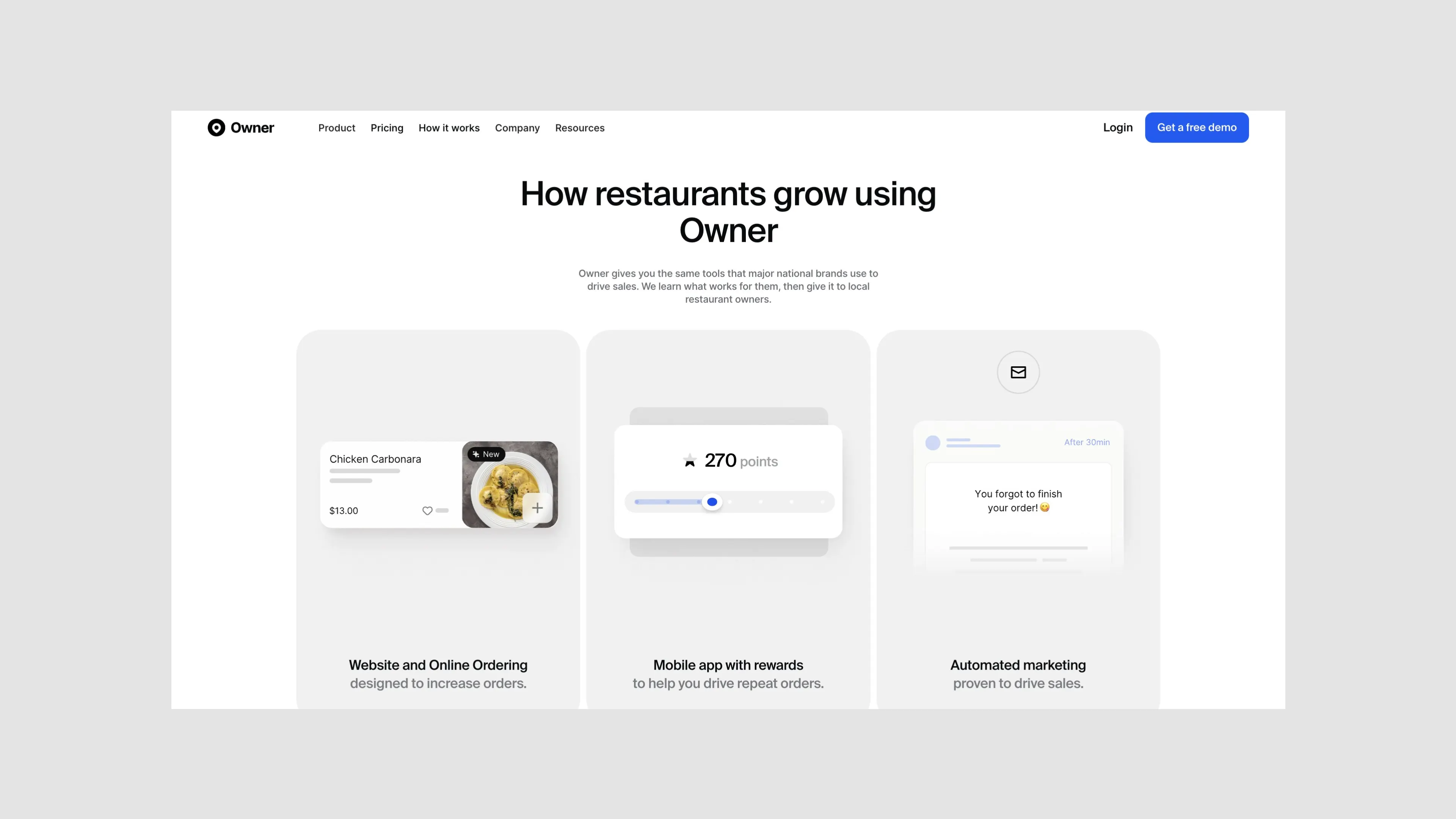
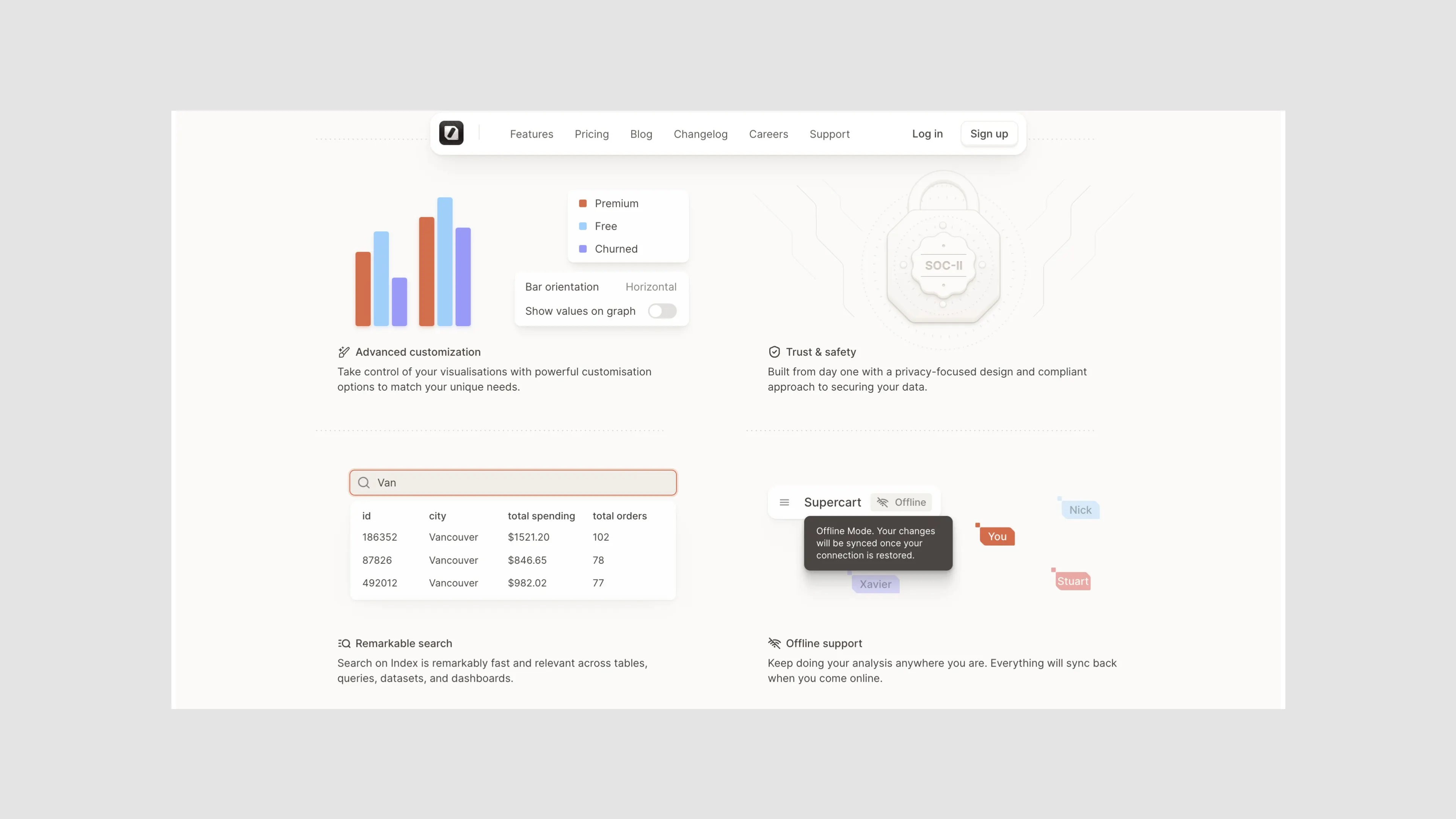
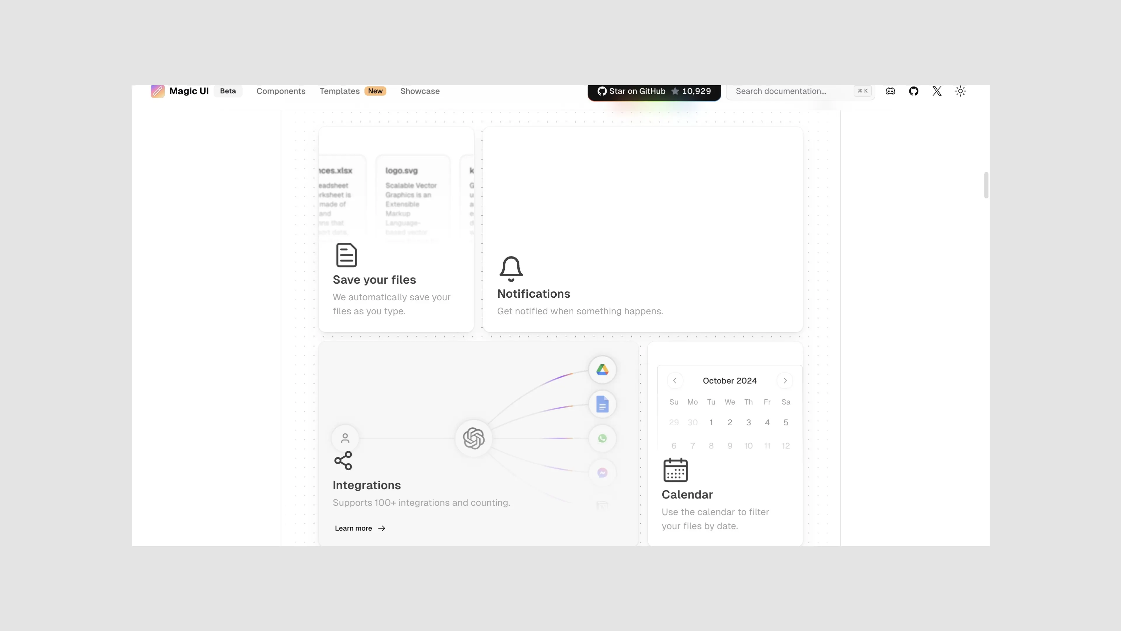
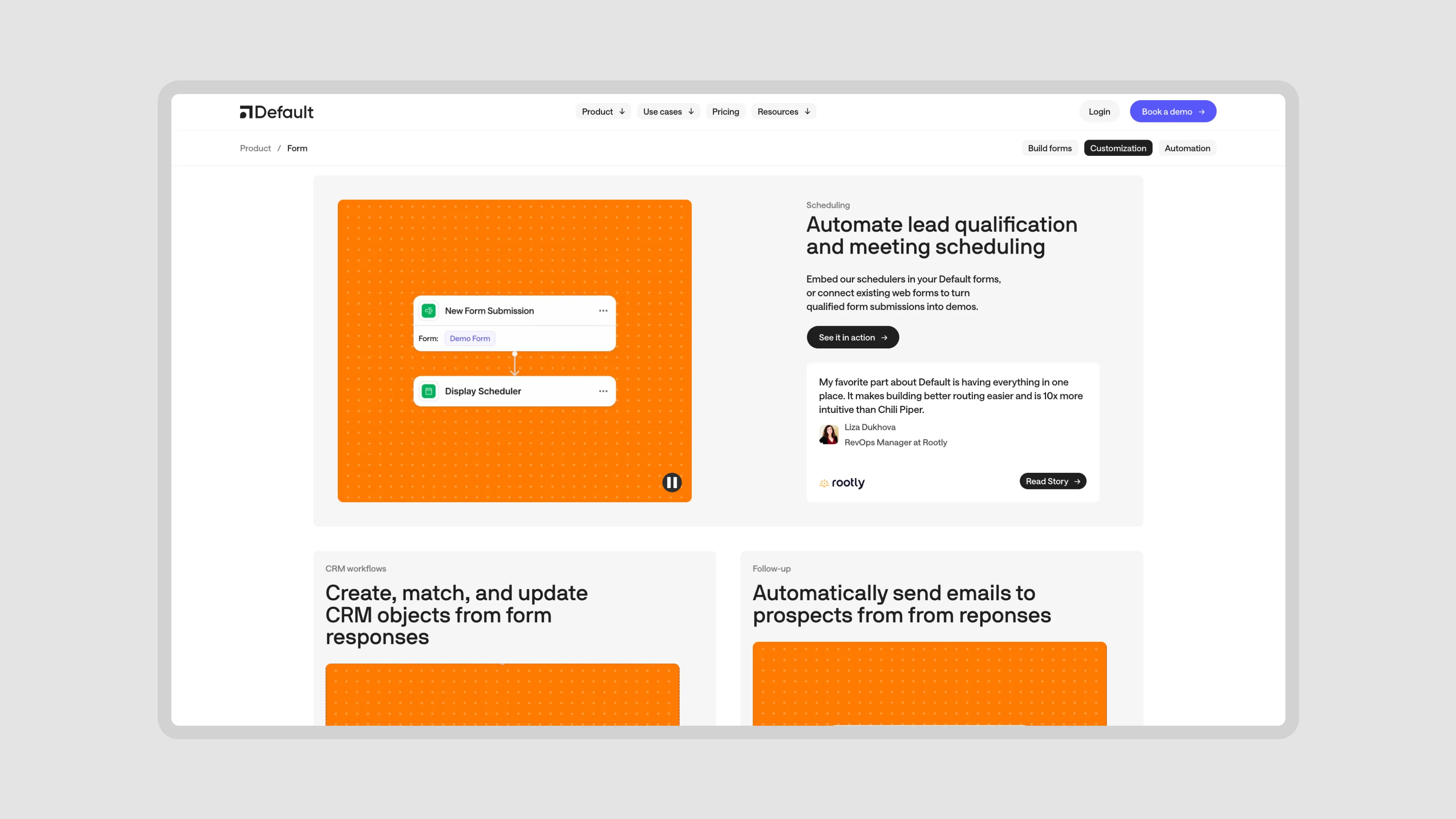
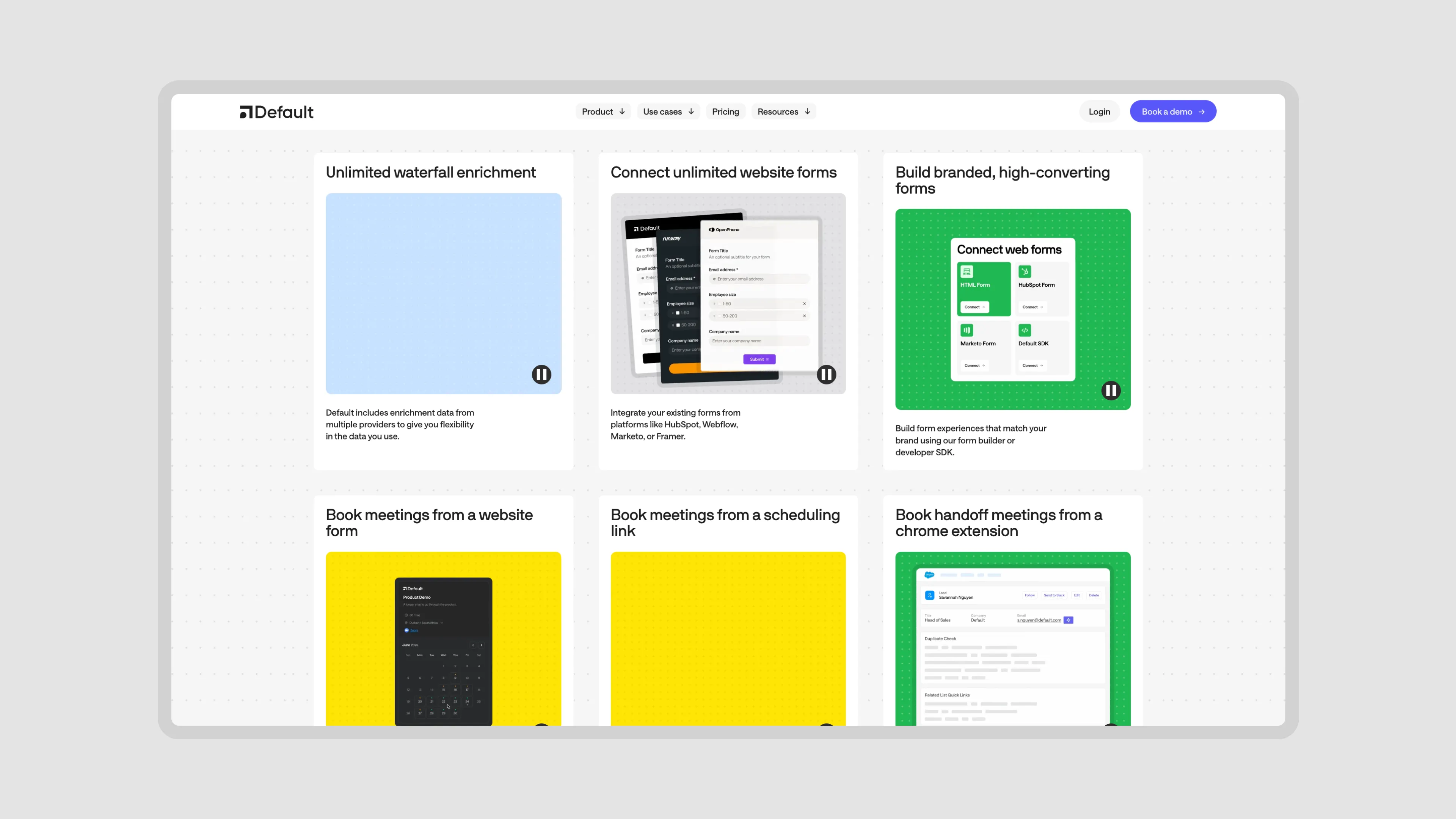
Product Resources
The second core component of the website was Product Resources. These are opportunities to not just describe what the product does, but show it in the relevant context. In context to:
the features of their Competitors
real Workflows you can build with the platform (Workflow Library)
industries and niches where the product is uniquely applicable
and customer stories and Case Studies where the product brought real, tangible benefit to real customers
The amazing thing about working for a client with a great product is that they have real statistics, stories, features, benefits. The product is strong and is genuinely able to bring massive value to customers. Our job becomes simpler: igure out the best and most effective way to display the content vs coming up with ways to try and make them look bigger.
That’s also what I enjoyed most about our collaboration with Replo. They had thousands of stores and customers who really loved the tool.
You will also notice that the Case Studies was a part of Product Resources instead of Content Resources on our sitemap, and that is intentional. Case Studies aren’t just SEO pages or Ads for the product, but instead are native to the product’s core offering. Without Case Studies, the product marketing is incomplete and is no longer positioned as a clear winner in what they do. Case Studies are meant to close the deal and supplement each Solution, Product Feature, and Benefit listed on the website.
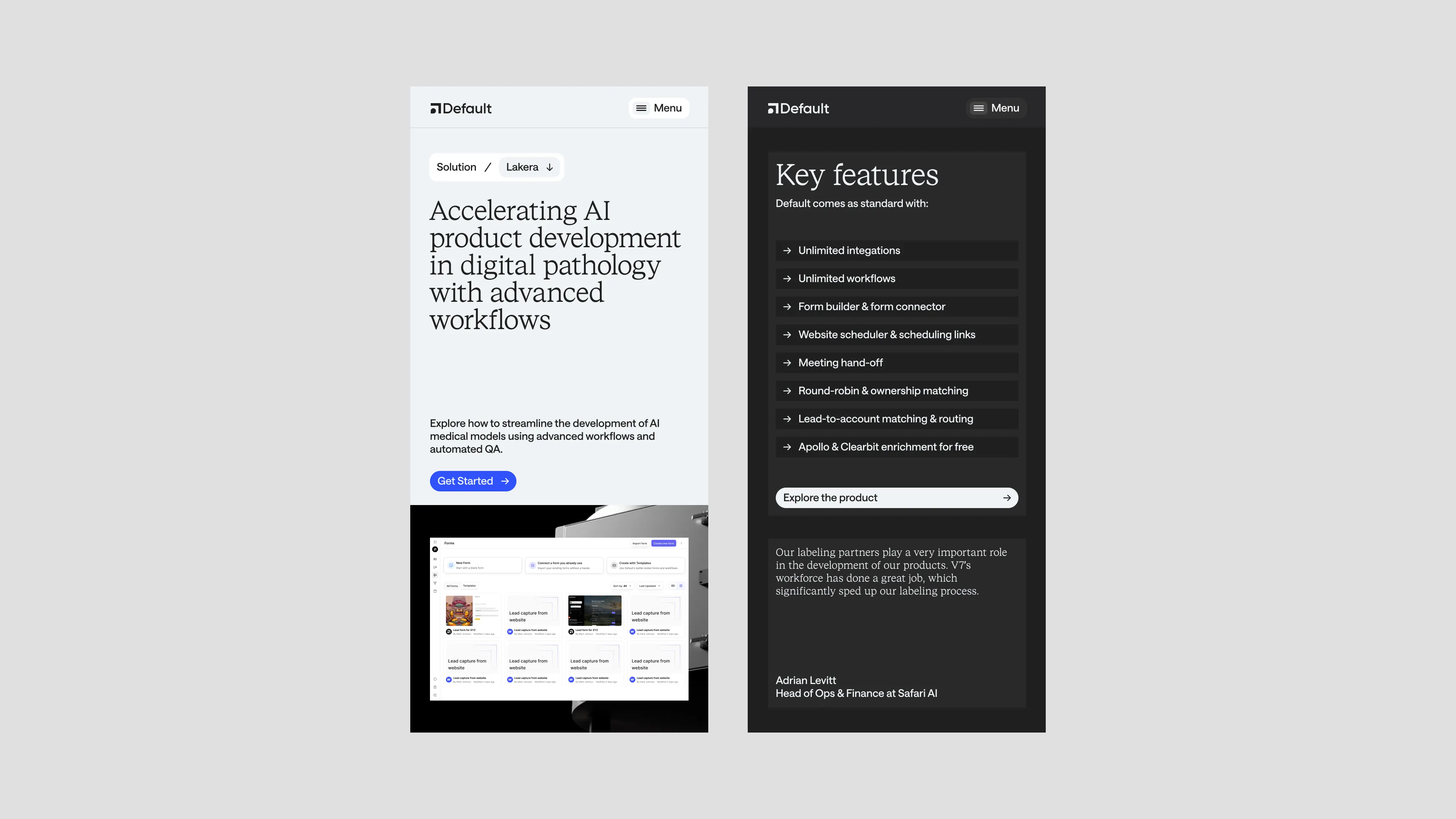
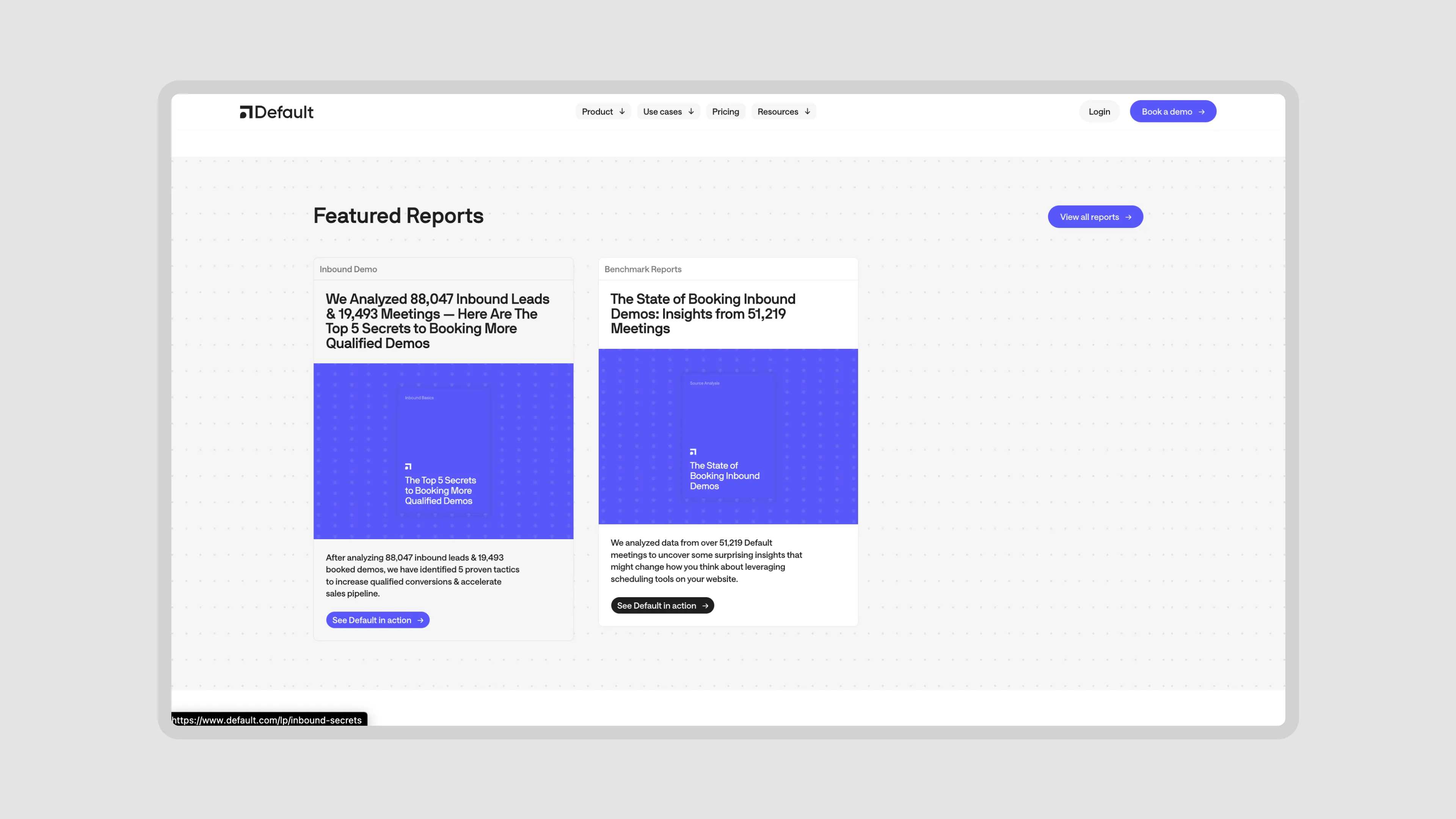
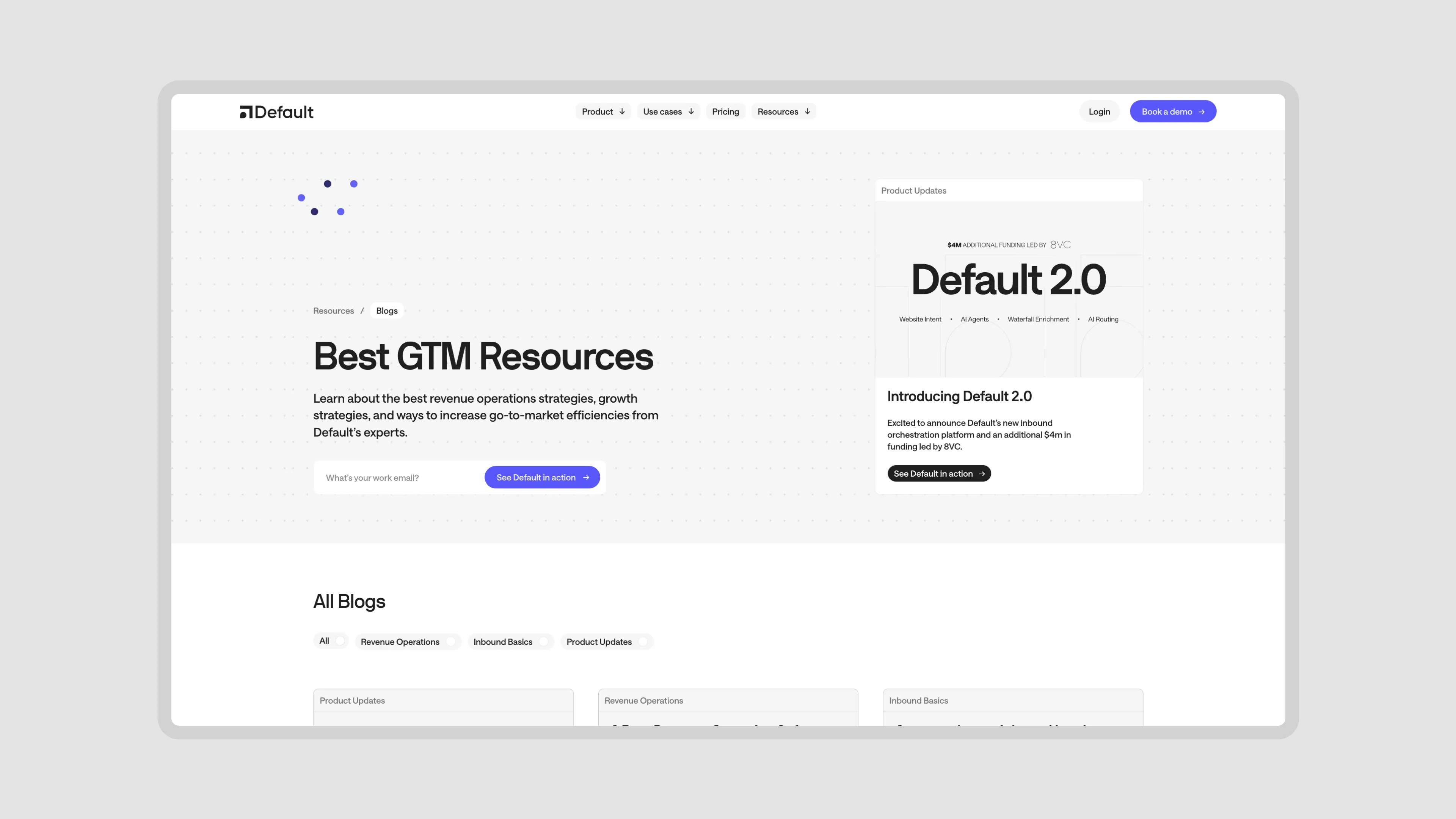
Content Resources
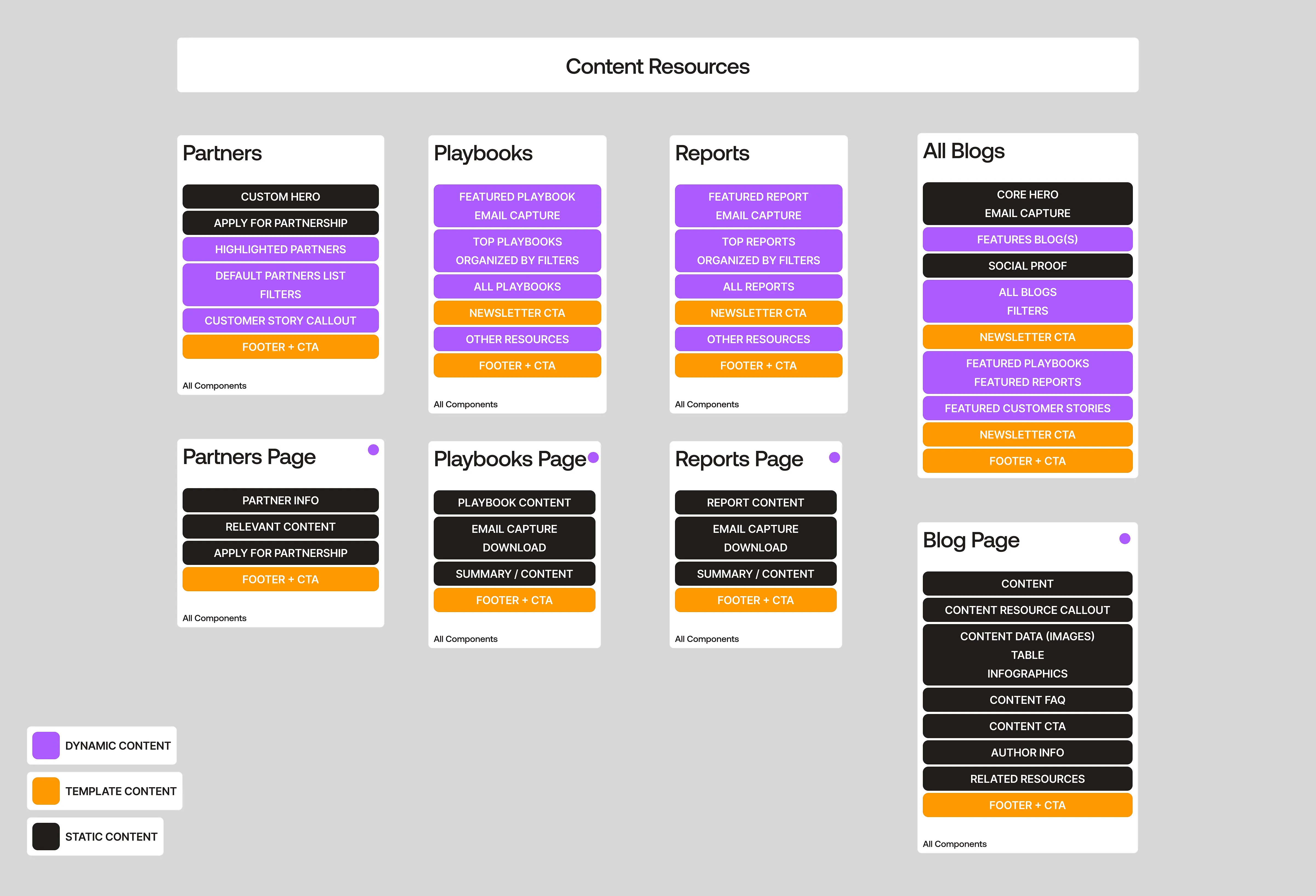
The final core component of the sitemap were the Content Resources: The Blog, Reports, Playbooks, and Partners. These are supposed to be repeatable pieces that the Default team can keep using and building on top of.
Other
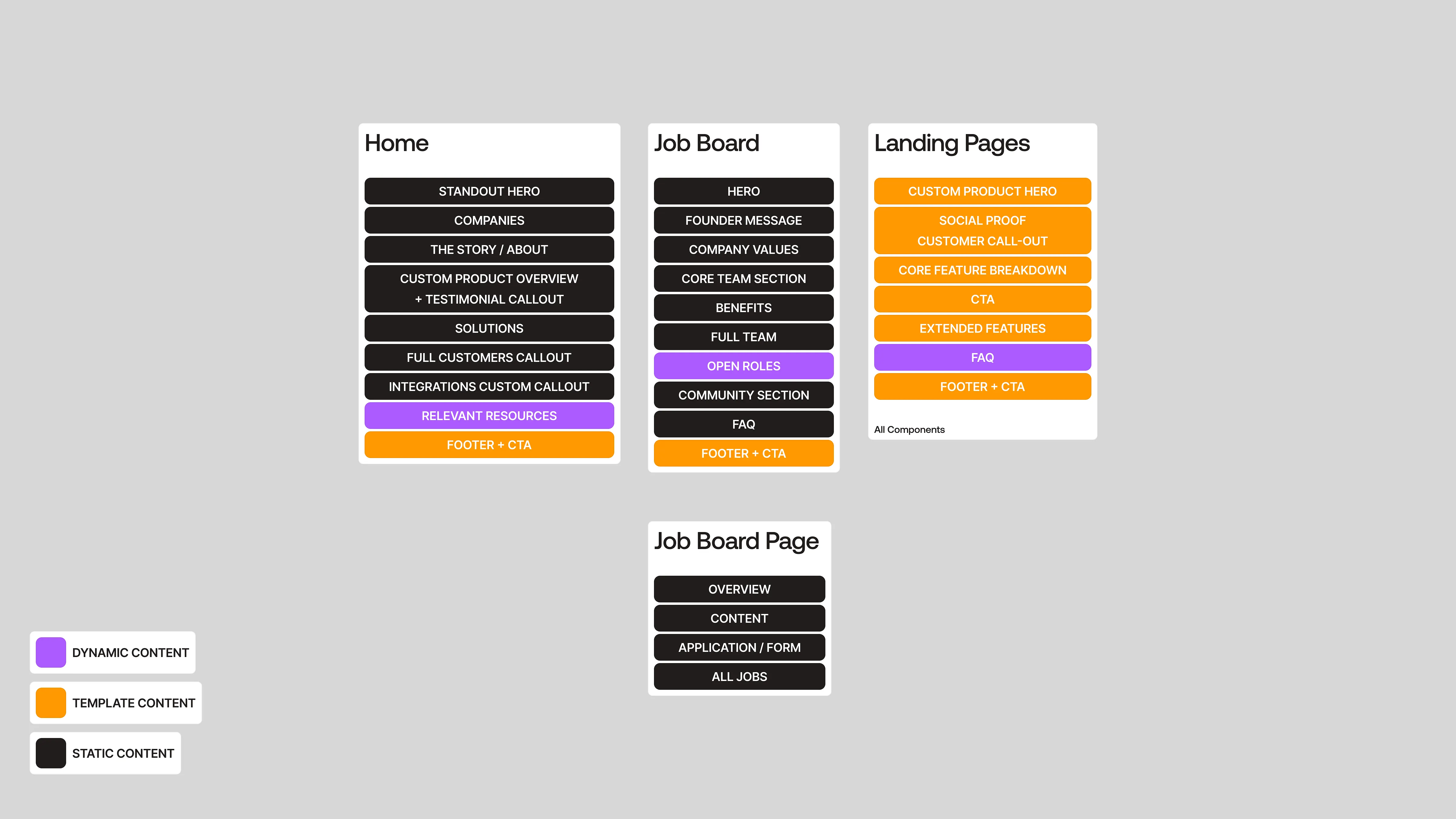
Finally, there are unique + supplemental pages like the Home Page, Landing Pages, and a Company Page. There were also some additional older content pieces that we wanted to lift directly from the old website.
We laid out all of their web content and pages, prioritized the sections that drove conversions, and re-packaged the website with just those. With this sitemap, we also knew which sections were being reused the most so that we could prioritize design on those, and gave us a really good idea on the level of content required across pages.
We laid out all of their web content and pages, prioritized the sections that drove conversions, and re-packaged the website with just those. With this sitemap, we also knew which sections were being reused the most so that we could prioritize design on those, and gave us a really good idea on the level of content required across pages.
Moodboards
We presented the moodboards on the same update as the Sitemap, since the moodboards actually do play a big role in setting the tone of the website and we can restructure content + change the strategy according to the general style we were looking to explore.
One thing I want to add here is that this is generally not our branding process, and we'd take a different approach for a full brand engagement. With Default, while they wanted to refresh their visual identity they did not want to completely restructure and rethink their brand strategy from the ground up. It was more of an evolution of the brand in context of the website.
One thing I want to add here is that this is generally not our branding process, and we'd take a different approach for a full brand engagement. With Default, while they wanted to refresh their visual identity they did not want to completely restructure and rethink their brand strategy from the ground up. It was more of an evolution of the brand in context of the website.
Moodboard #1: Technical + Grand Contemporary

How can we make default.com look like the end-all-be-all inbound platform? and make every other competitor feel like a cheap derivative?
Tone down the playfulness; double down on the core strengths and superior offering of the product and build a visually “default state” identity
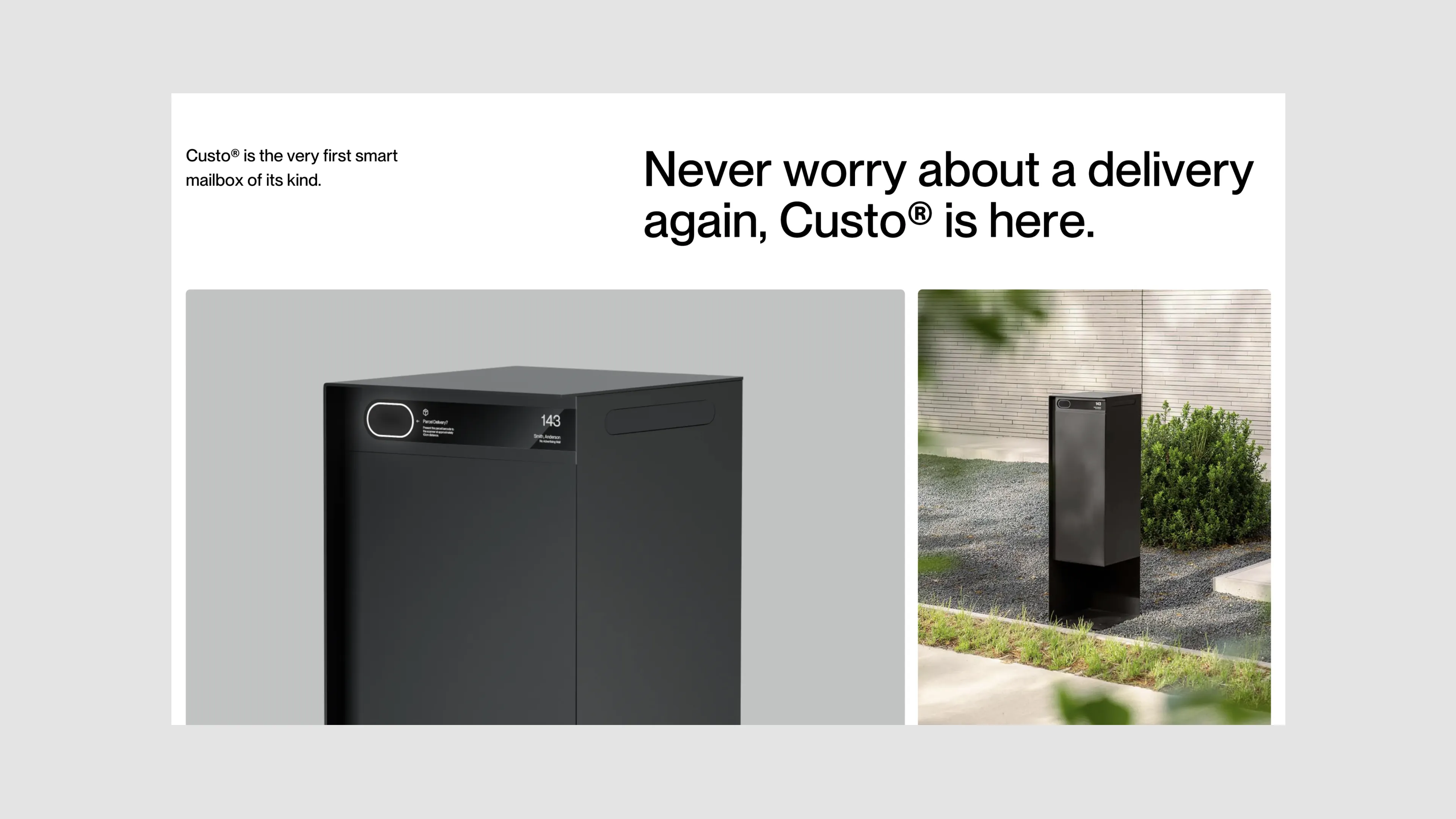
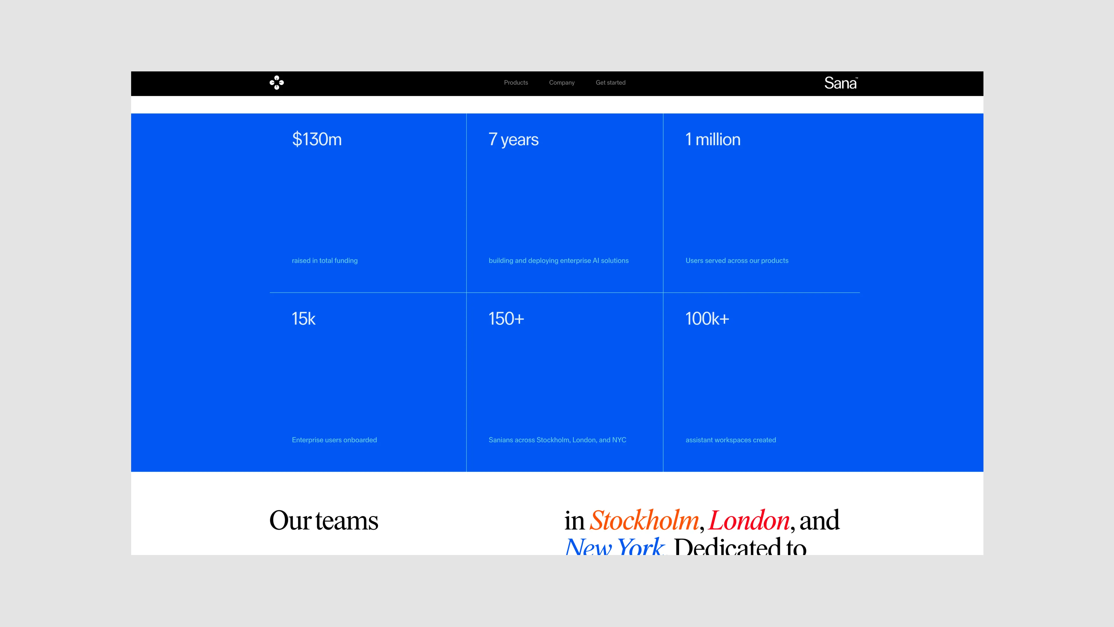
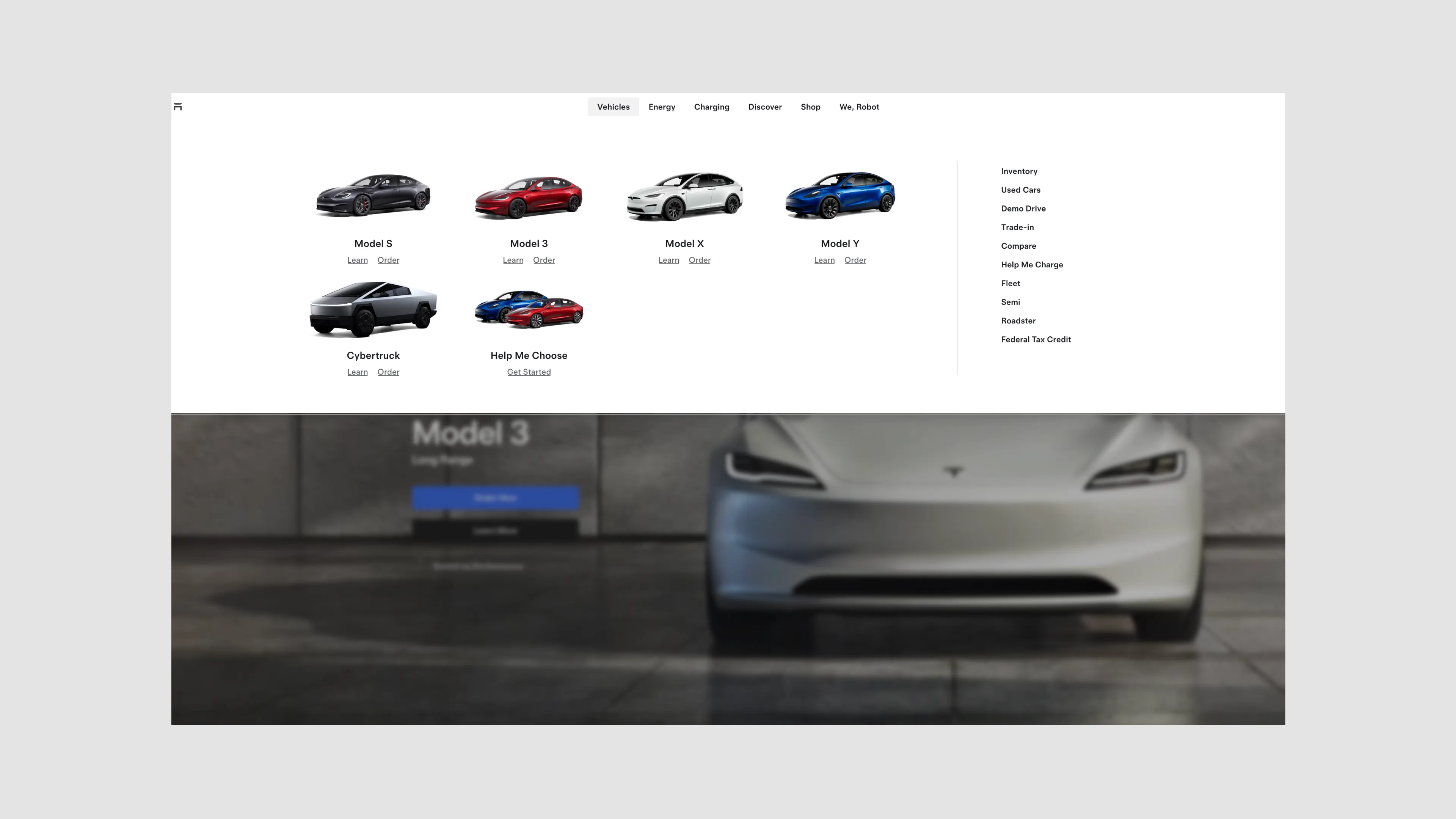
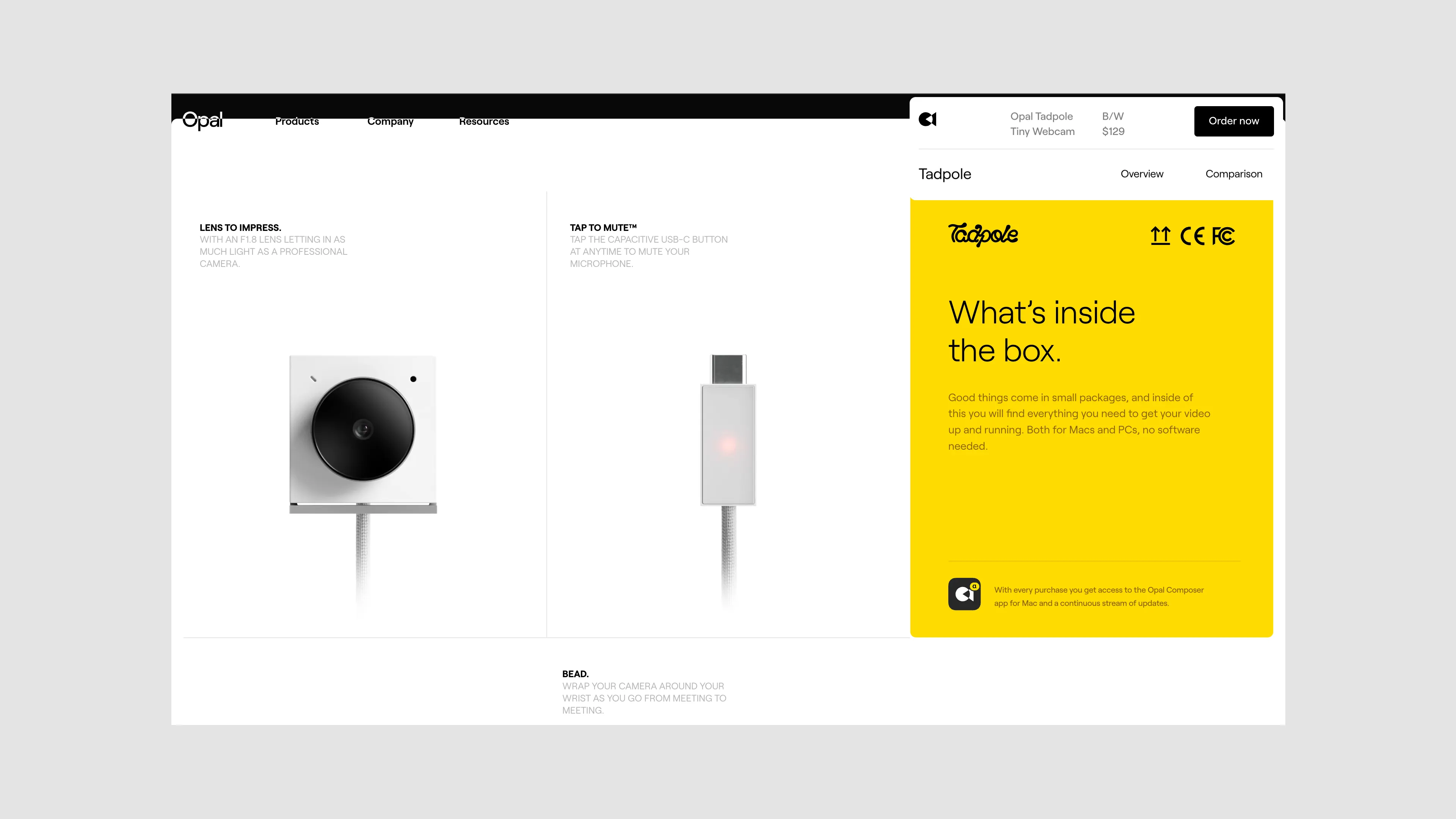
I’ll let the references talk for themselves, but we took inspiration from some of the best contemporary yet product focused websties out there. Tesla, V7 Labs, Opal, Custo, Sana. These companies are able to showcase their product in an instantly refined and elevated way. Clean typography, contemporary layouts, and minimal color systems.
The disadvantage here was that we were trekking a bit too far from traditional SaaS. The goal was still to convert, and some of these layouts felt a bit too experimental.
Tone down the playfulness; double down on the core strengths and superior offering of the product and build a visually “default state” identity
I’ll let the references talk for themselves, but we took inspiration from some of the best contemporary yet product focused websties out there. Tesla, V7 Labs, Opal, Custo, Sana. These companies are able to showcase their product in an instantly refined and elevated way. Clean typography, contemporary layouts, and minimal color systems.
The disadvantage here was that we were trekking a bit too far from traditional SaaS. The goal was still to convert, and some of these layouts felt a bit too experimental.
Moodboard #2: A Playful Visual World
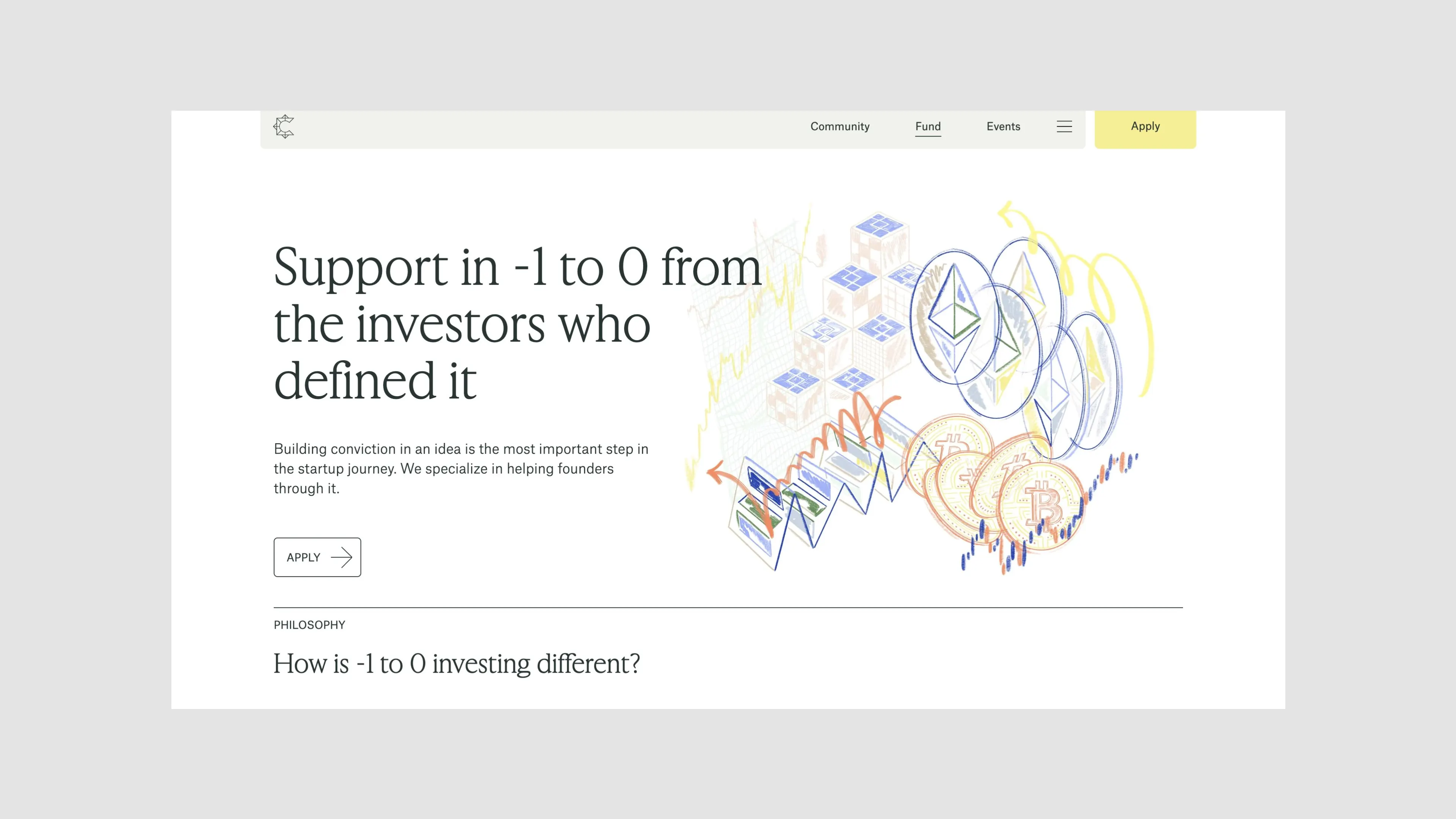
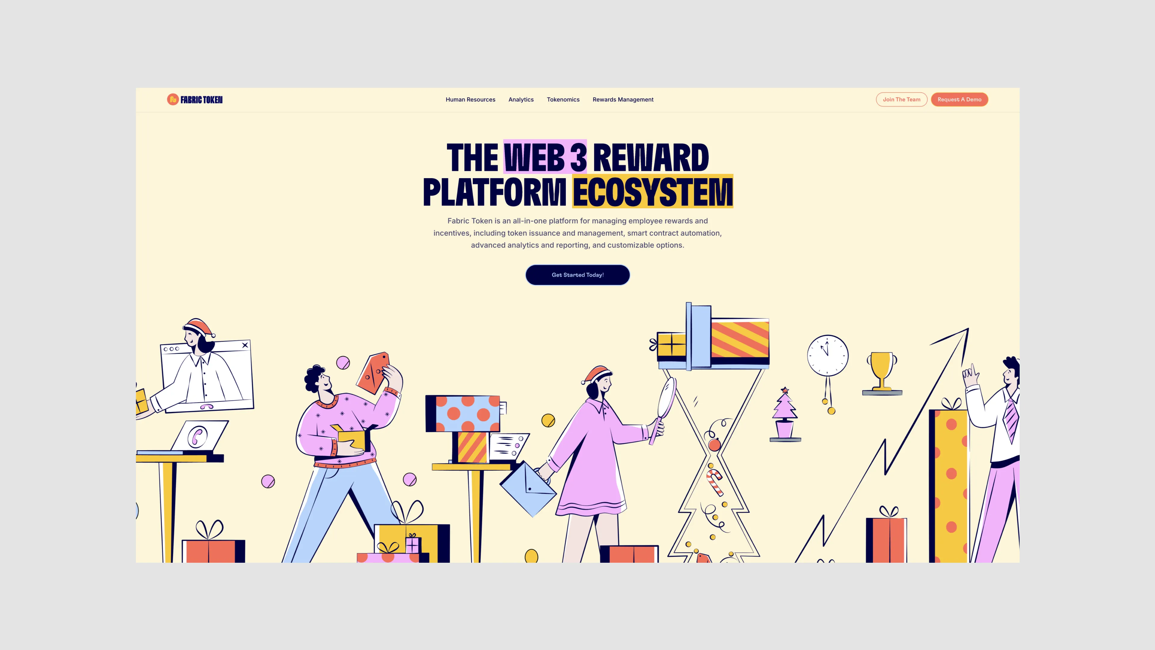

The complete opposite. build a recognizable identity by going all the way and creating an illustration powered website.
make every element interactive and feel playful + focus on bringing that into product ui and illustrations.
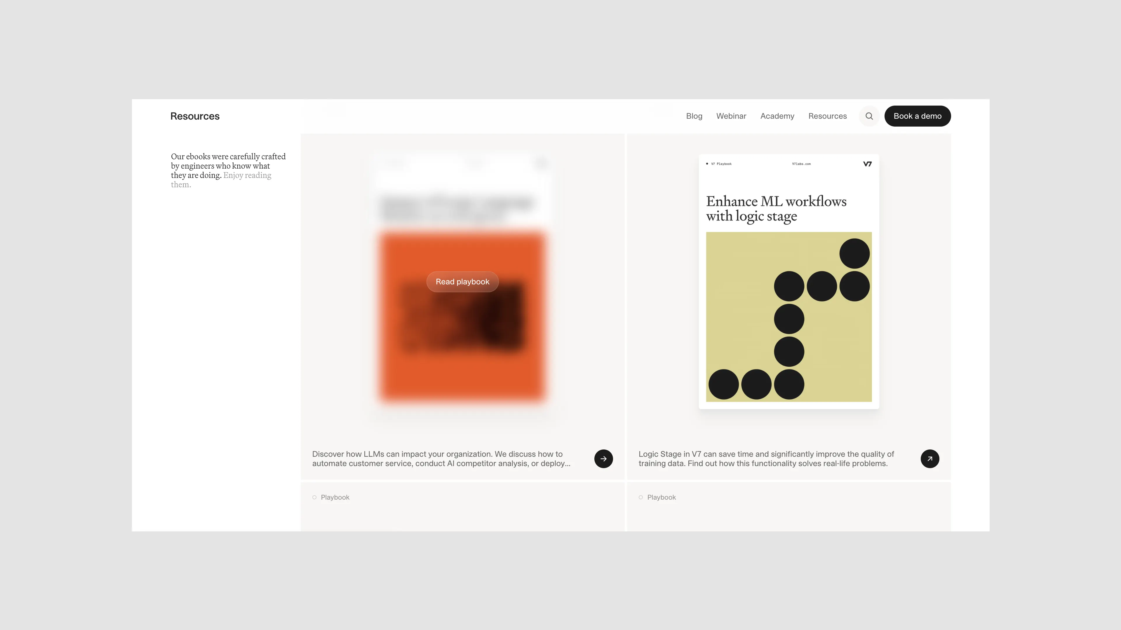
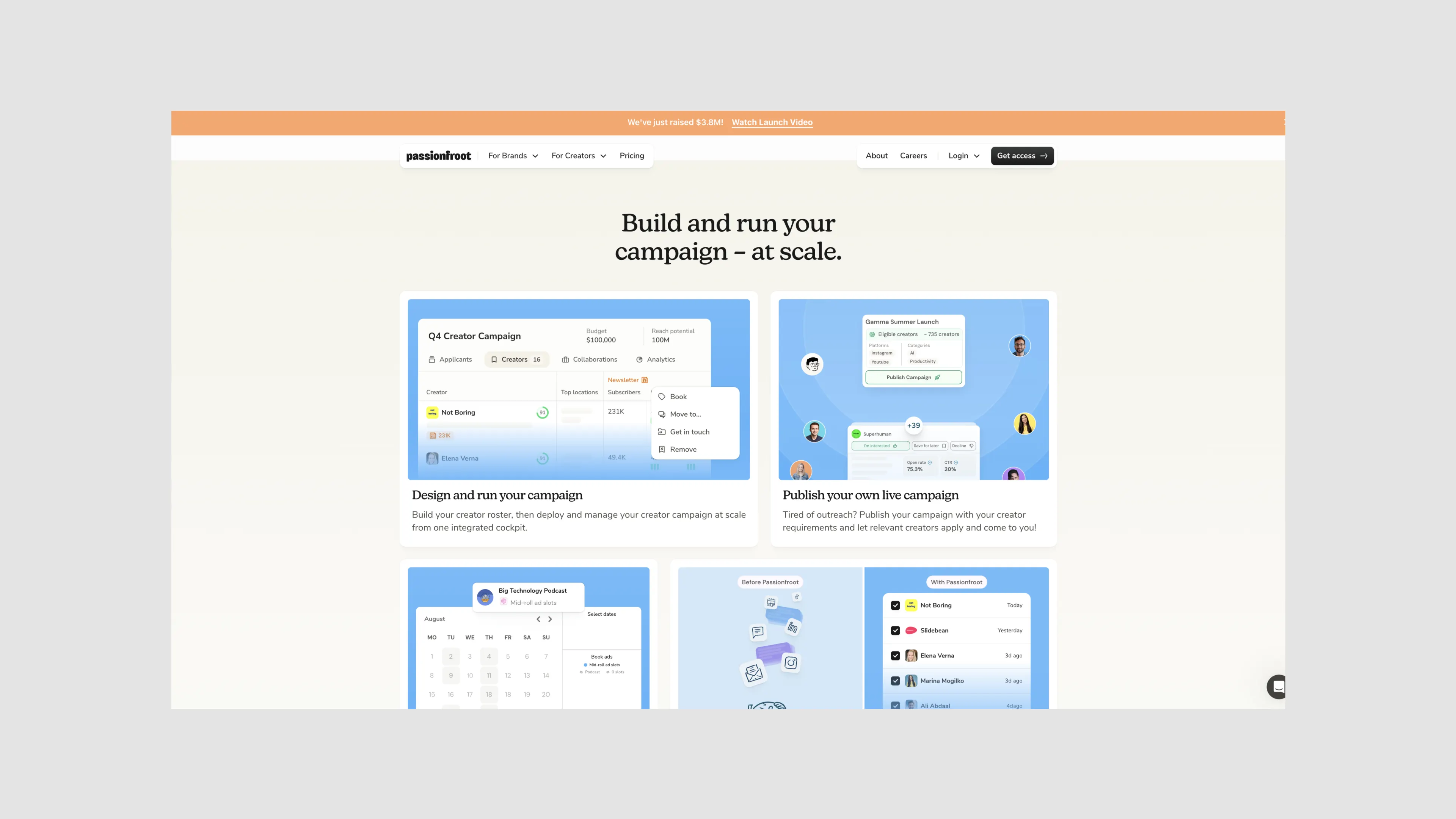
The common tie on these references were illustration heavy websites. Here the product is shown but in a more playful and illustrative manner. Tbh, these are websites we do the best and have done the most of. Where the sites feel branded, fun, but also product centric
Have a look at complicheck.in, replo.app, fabrictoken.co. All of those sites are quite illustrative and feel branded.
For Default, their older site felt quite close to these references, but it came with a cost where the features of the product aren’t reflected quite accurately.
make every element interactive and feel playful + focus on bringing that into product ui and illustrations.
The common tie on these references were illustration heavy websites. Here the product is shown but in a more playful and illustrative manner. Tbh, these are websites we do the best and have done the most of. Where the sites feel branded, fun, but also product centric
Have a look at complicheck.in, replo.app, fabrictoken.co. All of those sites are quite illustrative and feel branded.
For Default, their older site felt quite close to these references, but it came with a cost where the features of the product aren’t reflected quite accurately.
Moodboard #3: Product focused


a focus on product imagery and features, condensing the UI and retaining brand elements.
a simple website powered by minimal colours and mostly product ui
These references are quite product focused and straight to the point. Very little brand, and very high fidelity product ui images. These are cool but I find them to be too detailed and content heavy sometimes. Which can make things a bit harder to produce at scale when you’re dealing with a 20+ page website
TLDR — the feedback here was to combine some of the components from Moodboard 2 and 3 as Default wanted to feel personable and branded without loosing focus on their product features. Moodboard 1, although interesting and unique, was a bit too ambiguous for Default. It was also too much of a shift from the site they had at the time + felt like a full repositioning.
Visual Directions
On the next update, the goal was to take the feedbacks from each moodboard and come up with a way to visualize 2 options in context to Default.
One thing to note here is that since we’re working fast, we did proof of concept explorations. That means some of the assets or screens may have been pulled from inspo sites to paint a clearer picture on what we were envisioning.
For eg — showing a 3D model of a laptop screen gives enough context to make a decision on whether we want to try out 3D for the site. While modeling up a custom Blender scene, illustrating the product and adding all the details to make the render final is a bit overkill that essentially does the same thing, especially for a project on a tight timeline.
For eg — showing a 3D model of a laptop screen gives enough context to make a decision on whether we want to try out 3D for the site. While modeling up a custom Blender scene, illustrating the product and adding all the details to make the render final is a bit overkill that essentially does the same thing, especially for a project on a tight timeline.
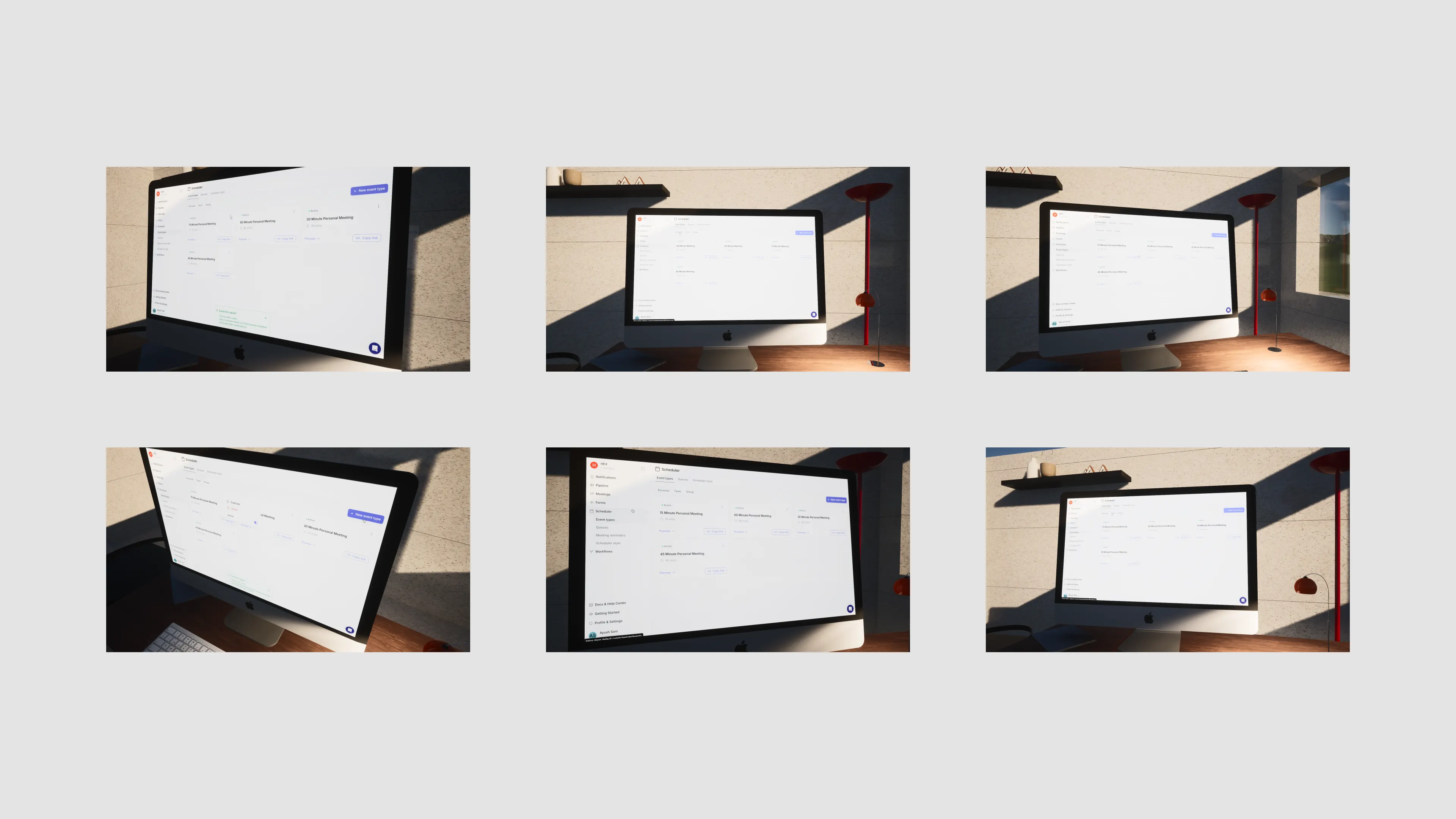
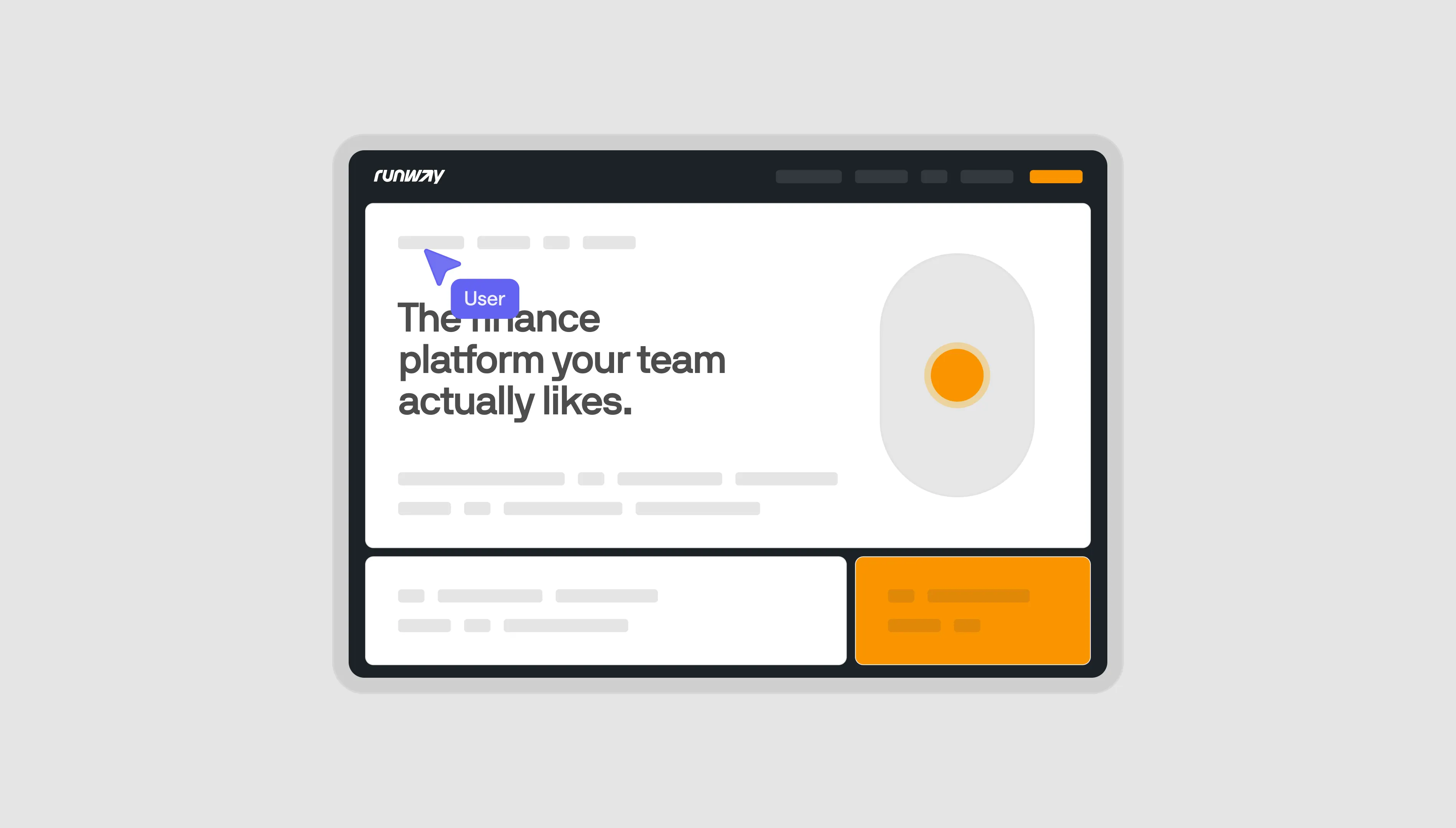
Concept #1
This concept is pulling from Moodboard #1 and #3 the most, with a focus on the product but in a slightly contemporary execution. I pushed for this idea internally as I felt there was something quite interesting about a SaaS site that embraced clean Serifs, contemporary layouts, and a slightly unpredictable visual hierarchy.
To me, this also served the idea of a Default-State since the mockups and backgrounds are quite “unbranded” and grey.
To me, this also served the idea of a Default-State since the mockups and backgrounds are quite “unbranded” and grey.


Concept #2
This felt like a very natural evolution of the Default brand, pulling away from the isometric illustrations and refining the layouts, typography, colours, and overall visual style.This concept is pulling from Moodboard #1 and #3 the most, with a focus on the product but in a slightly contemporary execution. I pushed for this idea internally as I felt there was something quite interesting about a SaaS site that embraced clean Serifs, contemporary layouts, and a slightly unpredictable visual hierarchy.
It has a focus on the product, but we still has playfulness and illustrative design through the use of “Dots” that convey connectivity, intelligence, and workflow.
It instantly connected and we ran with it. There were iterations that we made to this concept later on as we tested the brand on the entire site, but the general idea was this.


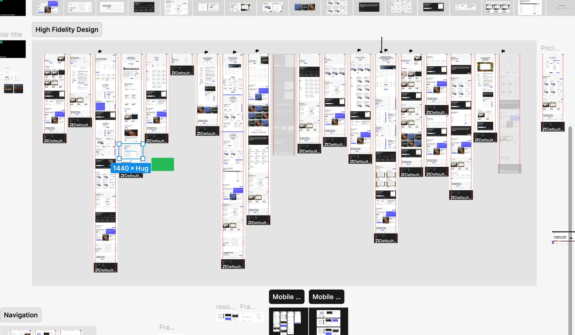
Low Fidelity Design
At this stage, we were ready to start putting together real layouts and sections and visually lay out the core website. We designed hero sections, feature grids, testimonial components, the footer, call to action items, etc based on the sitemap and started translating the content flow into Figma design.
During this process, the design language is subject to change — and you’ll see that soon — but the general website is getting mapped out. Since the timeline. Worth noting that we skipped out on the low fidelity sketches as it doesn’t aid to the velocity we hope to keep up on this project.
During this process, the design language is subject to change — and you’ll see that soon — but the general website is getting mapped out. Since the timeline. Worth noting that we skipped out on the low fidelity sketches as it doesn’t aid to the velocity we hope to keep up on this project.
We also pitched Default a concept to show 3D mockups to showcase their product. We ended up not building on top of this further, but was a fun exploration that I wanted to mention here.
High Fidelity Design
In the next update, we put together:
- New and improved styles and designs for common web components
- High Fidelity Design implementing those new styles based on feedback and changes
- Updated layouts, structure, content flow.
- New and improved styles and designs for common web components
- High Fidelity Design implementing those new styles based on feedback and changes
- Updated layouts, structure, content flow.
Common Web Components
We designed a small gallery of common components used across the website, with the goal to create the high-fidelity site based on top of those layouts. This included sections for
feature / benefits sections
grids
callouts
footer
client list
etc
feature / benefits sections
grids
callouts
footer
client list
etc


High Fidelity Design
This is the one of the most important parts of the process for me. Actually laying out the final high-fidelity structure for the website with all our final styles. At this stage, you need to start thinking about all the little design details that we earlier deprioritized over speed.


You’ll notice a lot of callouts and interconnected blocks that serves to drive traffic in multiple directions. Will detail on this a bit more towards the end, but at this stage all of the design and strategy we laid out earlier was coming together in a ready-to-develop, high-fidelity website design.
Navigation Design: Mobile and Web
The navigation of this website is quite important since it enables site-wide linking and is a single source of truth in sitemap organization for the end user.
We also had a lot of links we wanted to include here (that I talked about earlier) and making sure that they were coherently displayed was a priority.
We also had a lot of links we wanted to include here (that I talked about earlier) and making sure that they were coherently displayed was a priority.
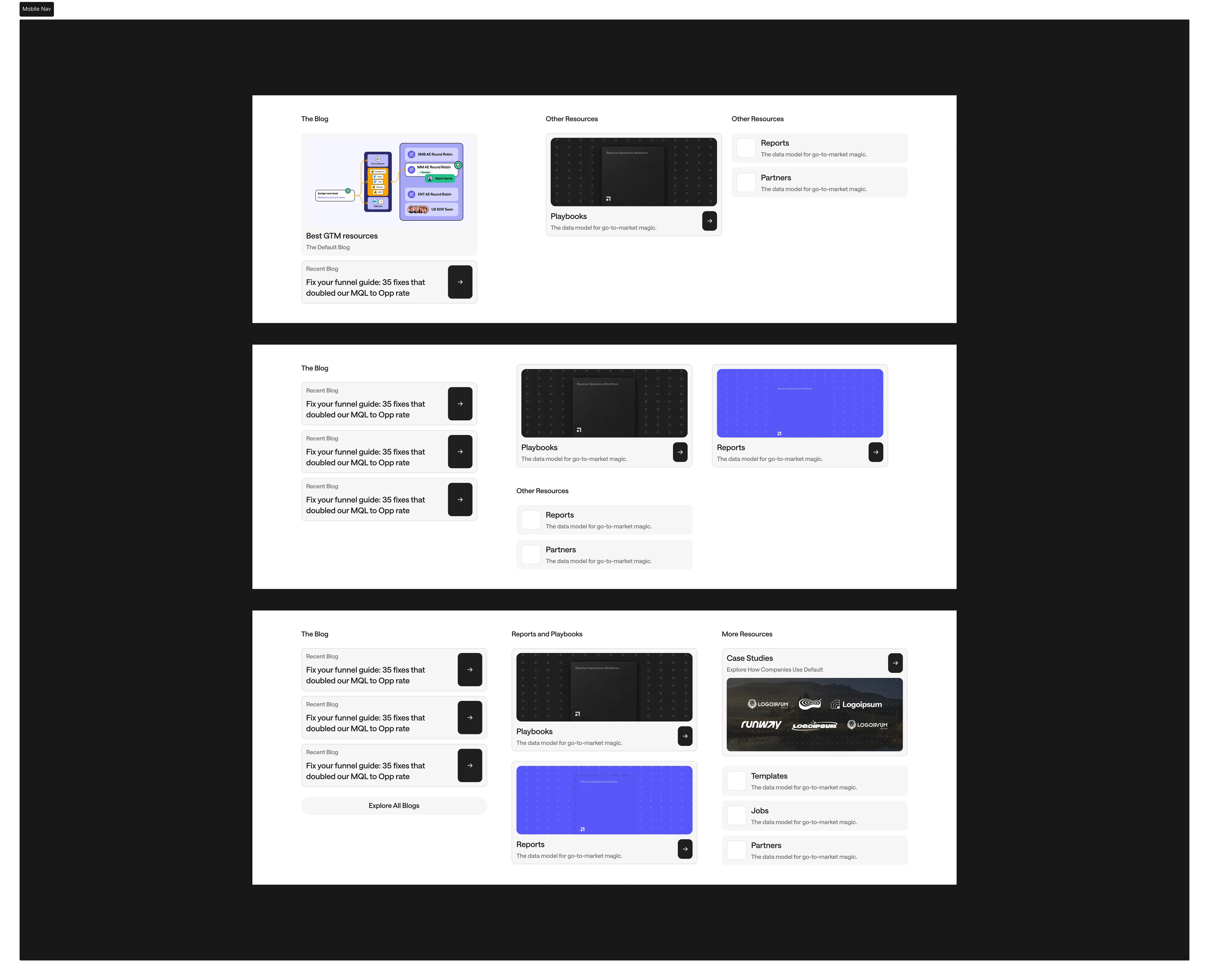
The navigation is also an underrated piece of real estate to show latest resources / workflows / etc and can actually serve as a great place to drive traffic + book demos from.
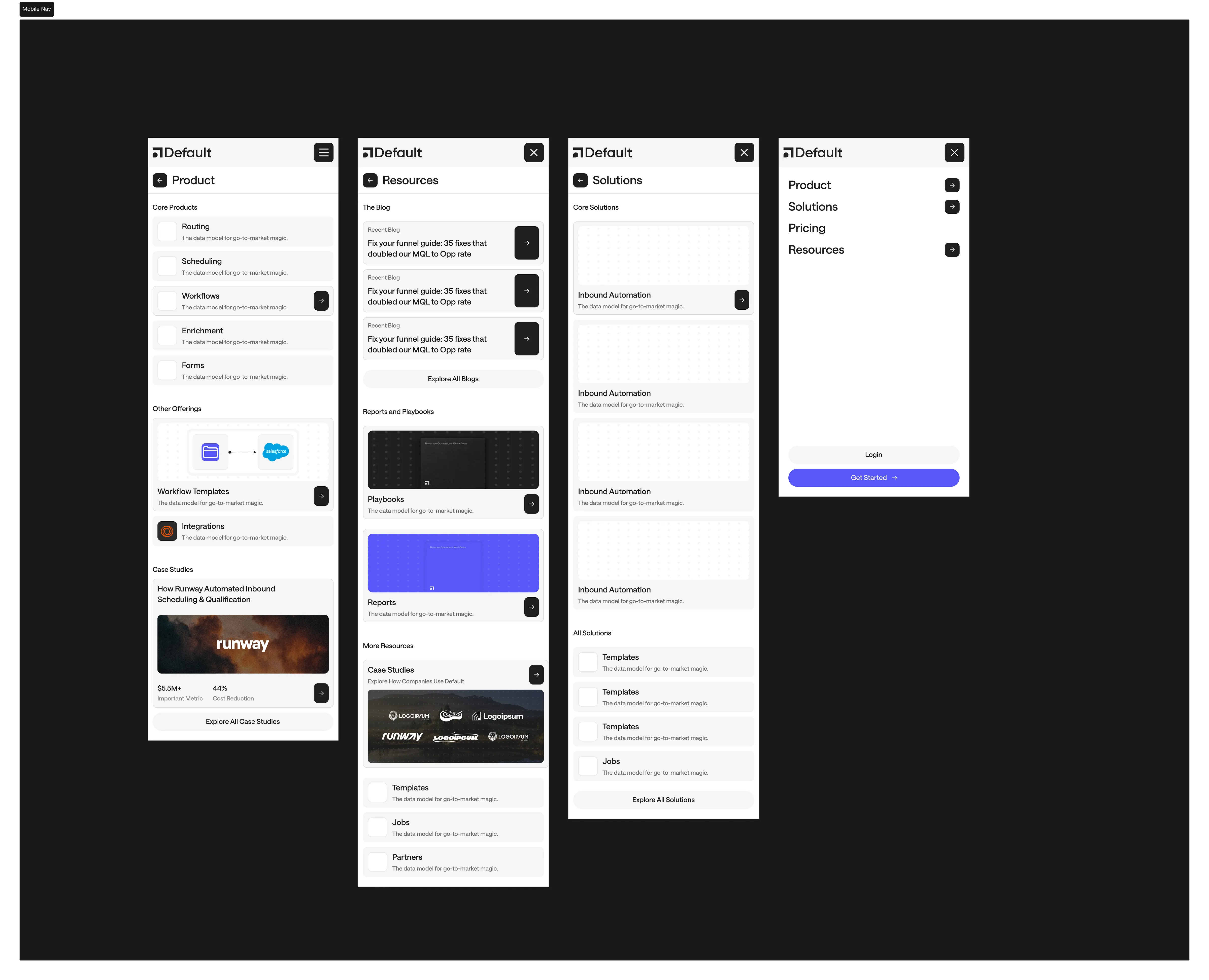
On mobile, we took a page from Tesla’s navigation and allowed the user to properly view content without having to deal with the flaws of generic responsive mega menus that end up getting quite cluttered or overly simplified to fit the limited real estate on mobile screens. This meant having seperate tabs for different menu items, allowing the user to view everything in a simple list format. Check it out on your mobile screen on defualt.com but below is the wireframe we did:
On mobile, we took a page from Tesla’s navigation and allowed the user to properly view content without having to deal with the flaws of generic responsive mega menus that end up getting quite cluttered or overly simplified to fit the limited real estate on mobile screens. This meant having seperate tabs for different menu items, allowing the user to view everything in a simple list format. Check it out on your mobile screen on defualt.com but below is the wireframe we did:
Core Web Assets
Since we were rolling out a brand new Reports and Playbooks section, we wanted to introduce the new branding with those assets and created a mini design system to allow the clients to quickly create and update those assets with our patterns / colors / typography.
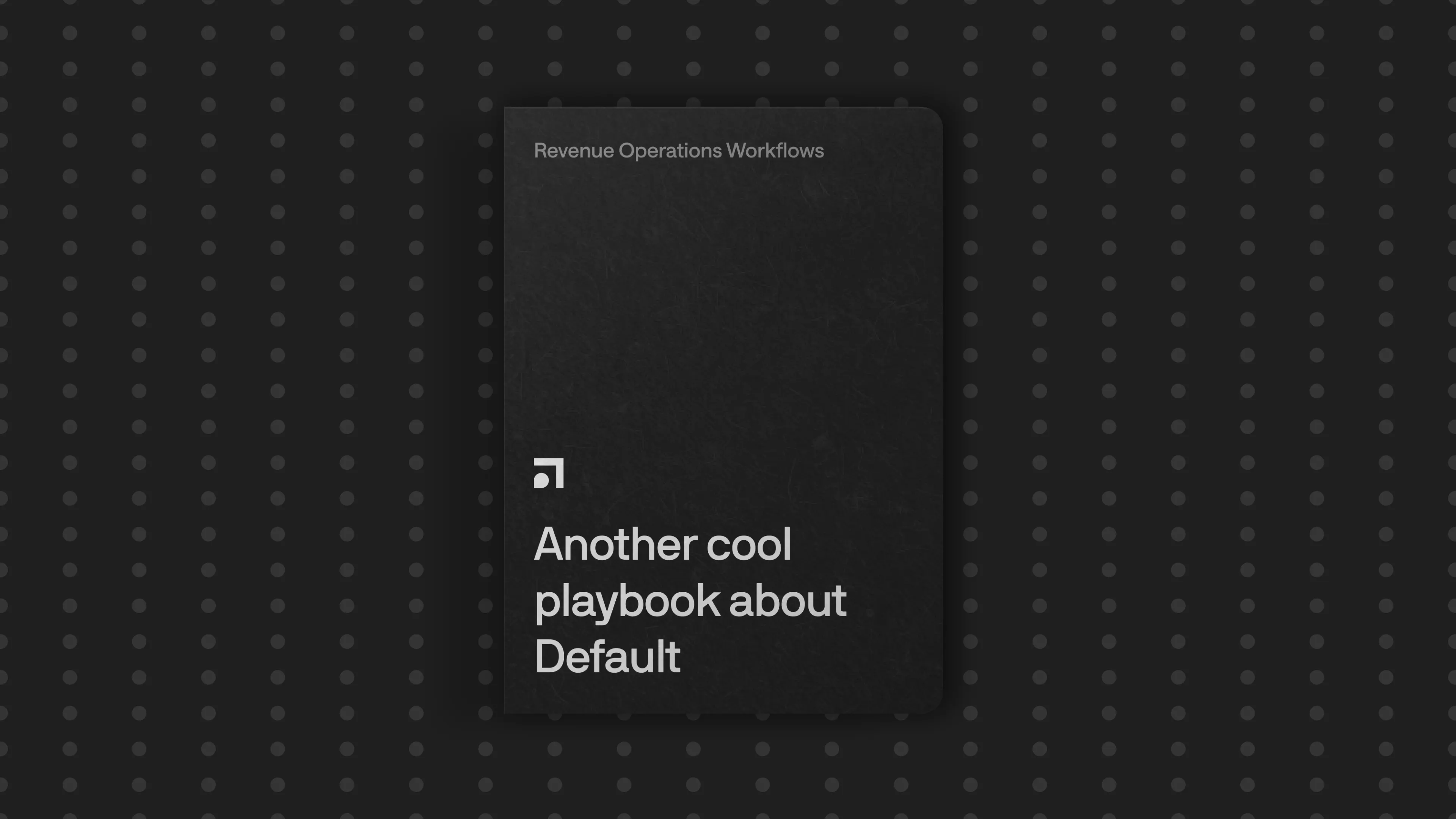
We also created a way to add some fun imagery to spice up the case studies component.
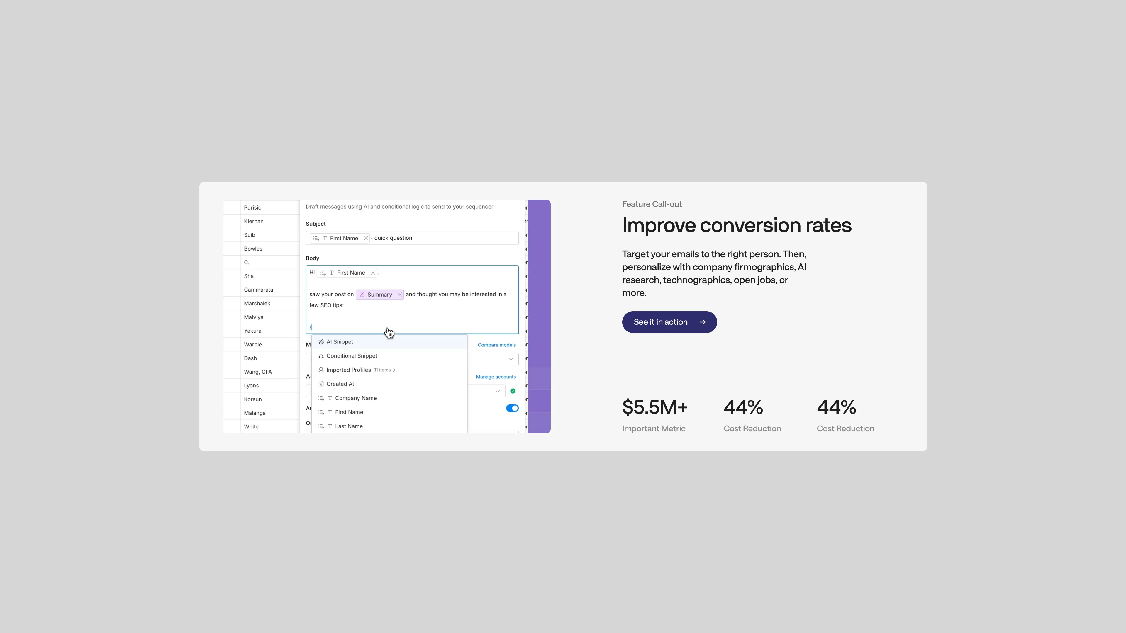
Product UI Design
This is probably the hardest + most exciting challenge for this project. With any SaaS / software, the product UI is the single most important part of the website. This is how customers interact with your product, before getting into your product. This is the single strongest visual and where you should be putting most of your focus on.
A great layout with good copy will convert, but without effective visuals on showing how the product actually works you’re missing out on key converstions. This is super obvious, but it’s insane to see some websites putting way too much focus on brand and “web design” while neglecting product UI.
There are 3 main ways to show product UI on B2B sites:
Screen Grabs / Screen Recordings
I actually think this is the best approach for most companies. Simply show the product without dumbing it down and let people get a feel of how things work.
Illustrations / Graphs
This approach is where you showcase your product like a graph or diagram. It’s a clever and branded way to show often boring layouts which works well for products where the screen grab doesn’t do justice. We did this approach for withlantern.com
Condensed Product
This is my favourite approach for complex products with a lot going on. This is when you condense a massive product into specific product features that you want to zoom into, and you show it being used in context without any of the extra layouts. This is the approach we went with for Default. Will elaborate more on why below.


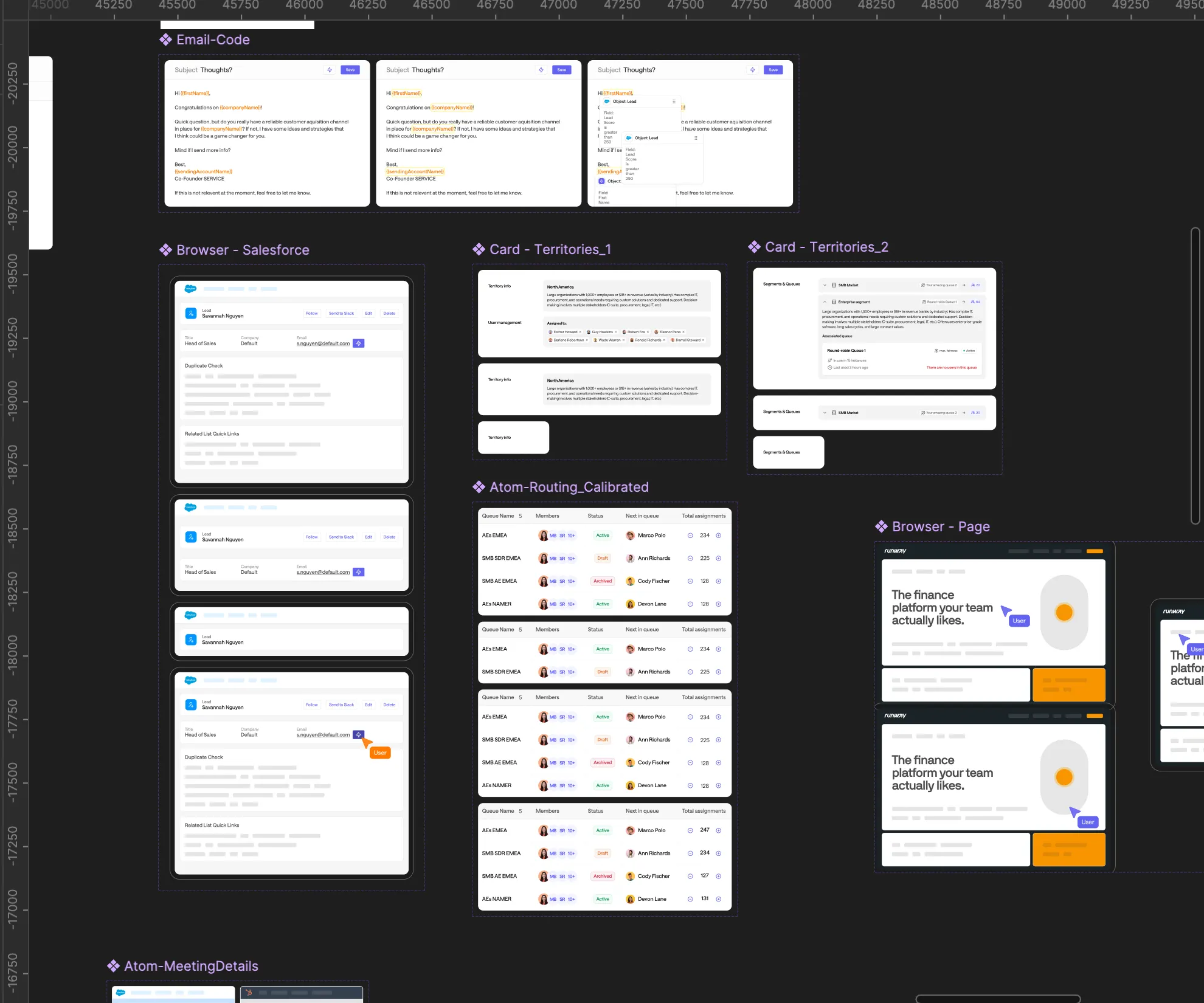
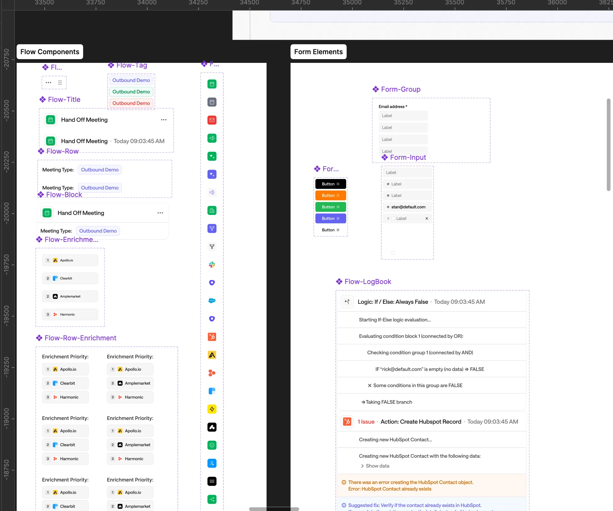
As a part of this new website, we faced 2 major challenges pertaining to product UI:
1. We had a lot of great product features but they involved showing third party items like websites / emails / forms / etc and it’s really HARD to do all of that on Screen Studio while still keeping focus on the actual product features.
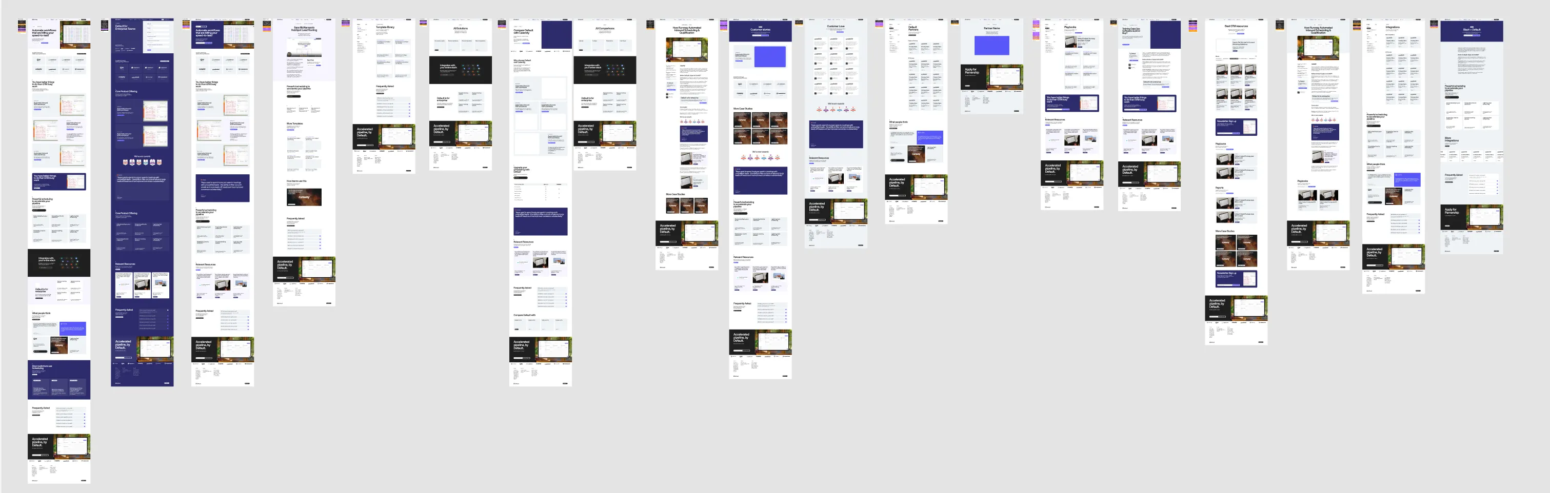
2. A lot of the product is basically workflows and animations, which means they all look like the image below and it’s hard to add personality or show the features in context without it feeling super monotonous and repetitive.
So we had to essentially redesign a simplified and illustrated version of their product, design “sample” websites, forms, flows, emails, and animate all of that for this website. Below are some random samples of illustrations in our new condesnsed style
1. We had a lot of great product features but they involved showing third party items like websites / emails / forms / etc and it’s really HARD to do all of that on Screen Studio while still keeping focus on the actual product features.
2. A lot of the product is basically workflows and animations, which means they all look like the image below and it’s hard to add personality or show the features in context without it feeling super monotonous and repetitive.
So we had to essentially redesign a simplified and illustrated version of their product, design “sample” websites, forms, flows, emails, and animate all of that for this website. Below are some random samples of illustrations in our new condesnsed style

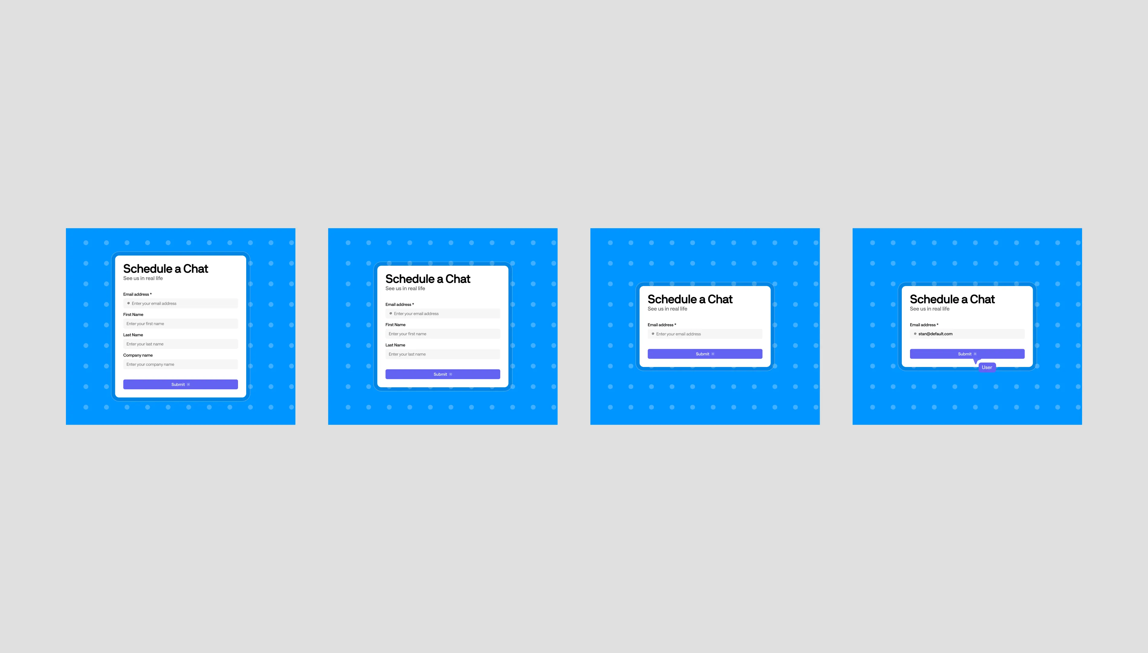
Product UI Animations
Another challenge we faced was that a single still image did not fully convey the flow of the product feature. For eg — for a flow where someone clicks a demo button on a website and opens a form + books a meeting, a single image doesn’t do it justice. So we had to get creative and build a design system using Figma Prototype to enable interactivity + motion into all of the flows
Here’s some of those animations in action
Here’s some of those animations in action
We did a LOT more. Like 30+ more. Check them out across product pages on default.com
Product UI Design System
Since we wanted to move fast and maintain consistency, we created a mini design system to manage everything. This also enables them to create these flows and animations consistently across new pages if they have to.


Rive Animations and Easter Eggs
We wanted to have fun and showcase some cool Rive easter egg animations across the website, so we built on top of the “dots” experiment to show some modularity in a nice motion loop.
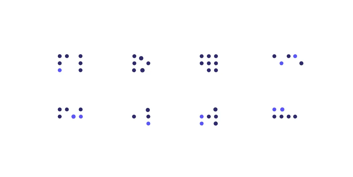
I think they look much cooler in context: http://default.com. We have them randomly sprinked across the home page just to add some more playfulness.
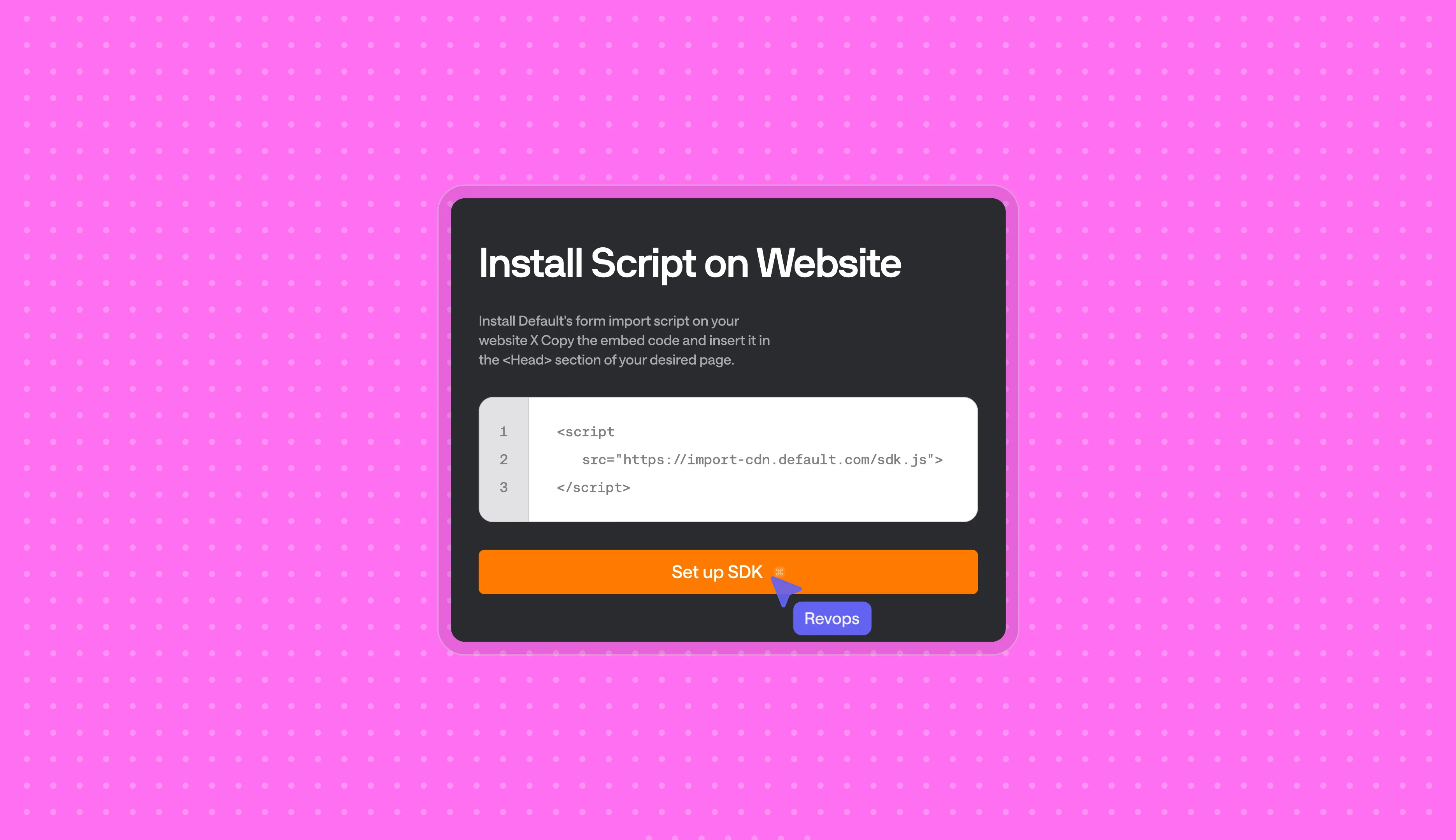
Webflow Development
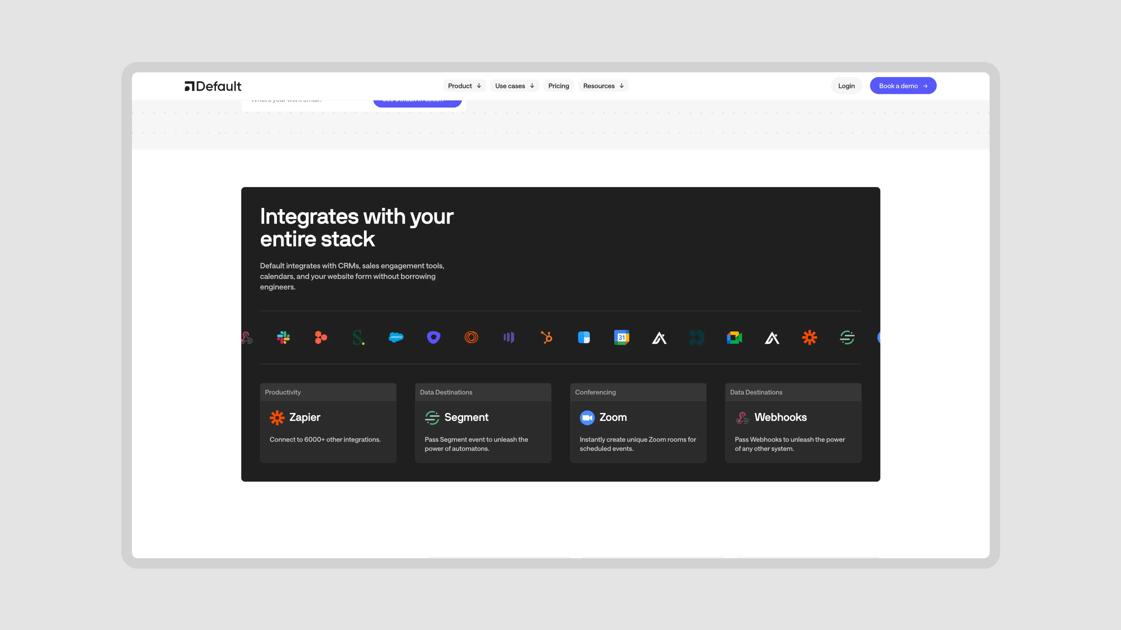
There was a lot of pieces to this development for the project. Custom code, multiple mini-apps, CMS collections, and unique development / functionality challenges.
Website Functionality and Build
We ended up not using drag and drop library and setting up layouts using a customized version of Client First. Normally, something like Relume would save a lot of time but in this case we felt more comfortable having a leaner layout system / less classes whenever we could.
CMS Set-up
We had a ton of CMS collections including: Blog, Reports, Playbooks, Partners, Workflows, Templates, Case Studies and Integrations.
Now that is out the way, I want to spend some time walking over some of the unique features and items that we created for this website:
CMS Powered Workflow Gallery
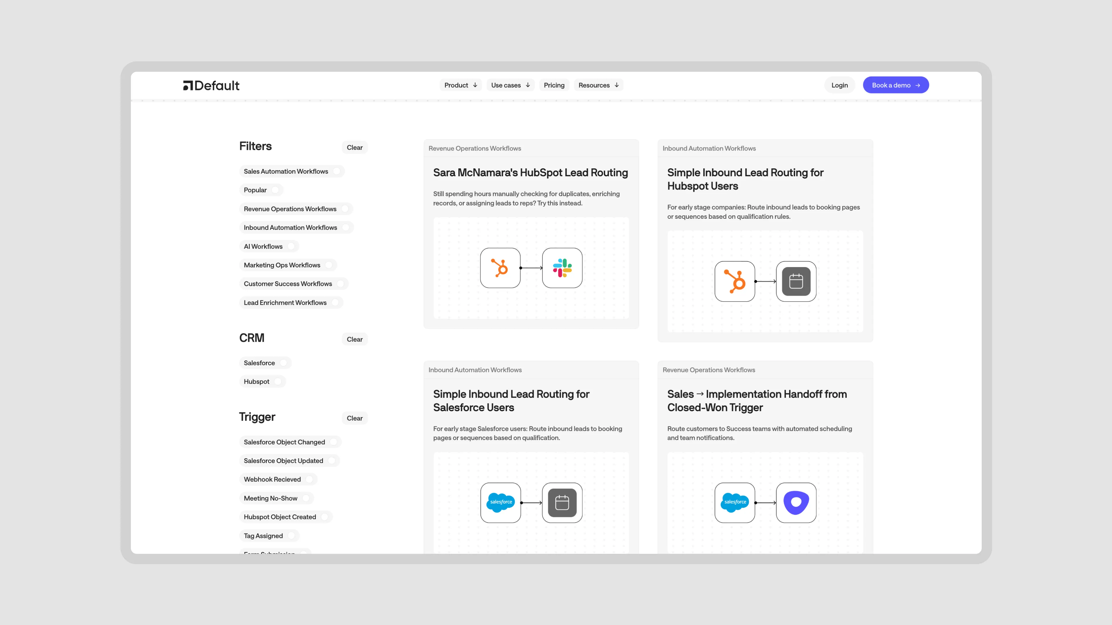
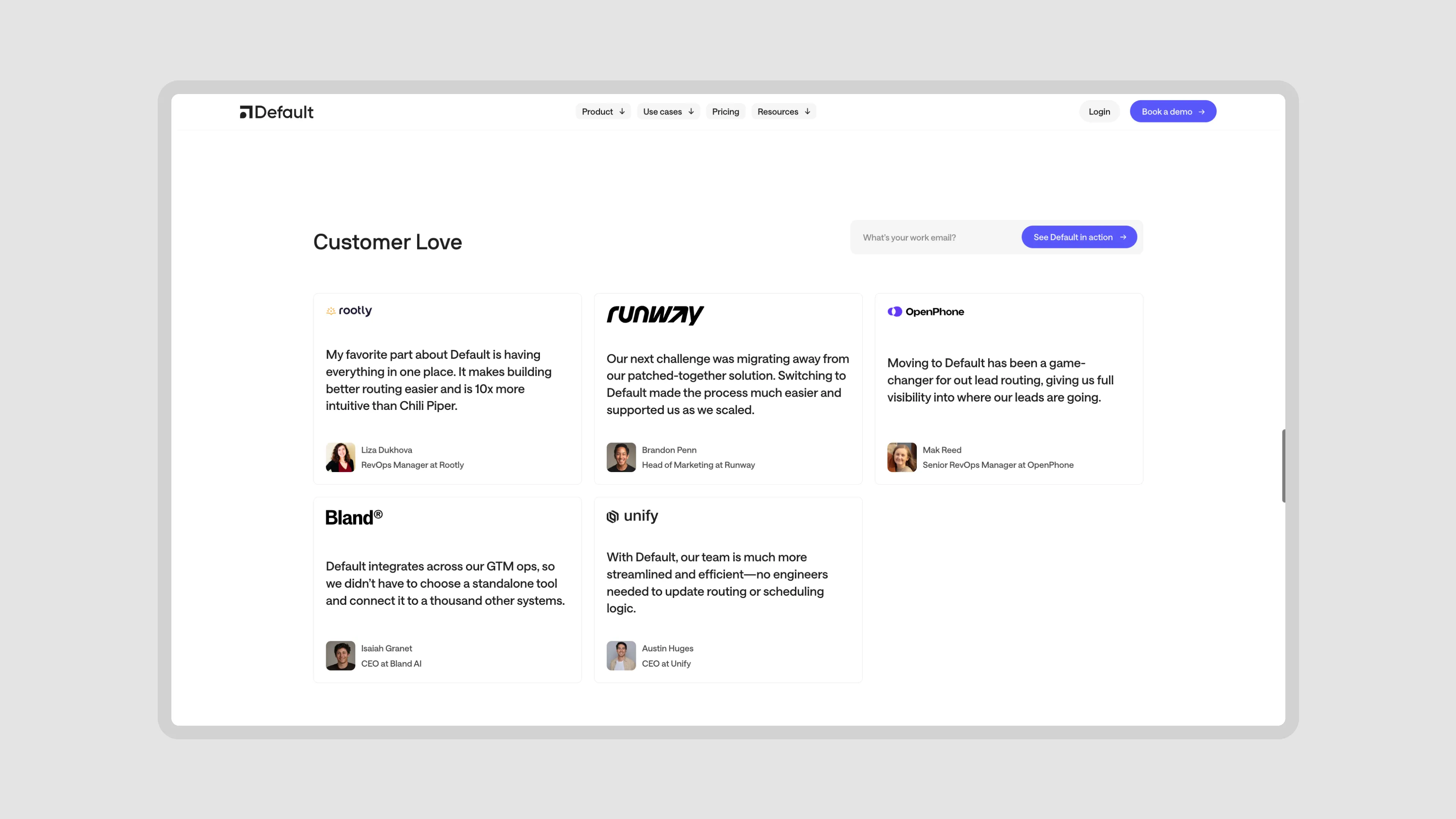
Case Study Blocks across the website

Dynamic Integrations Block
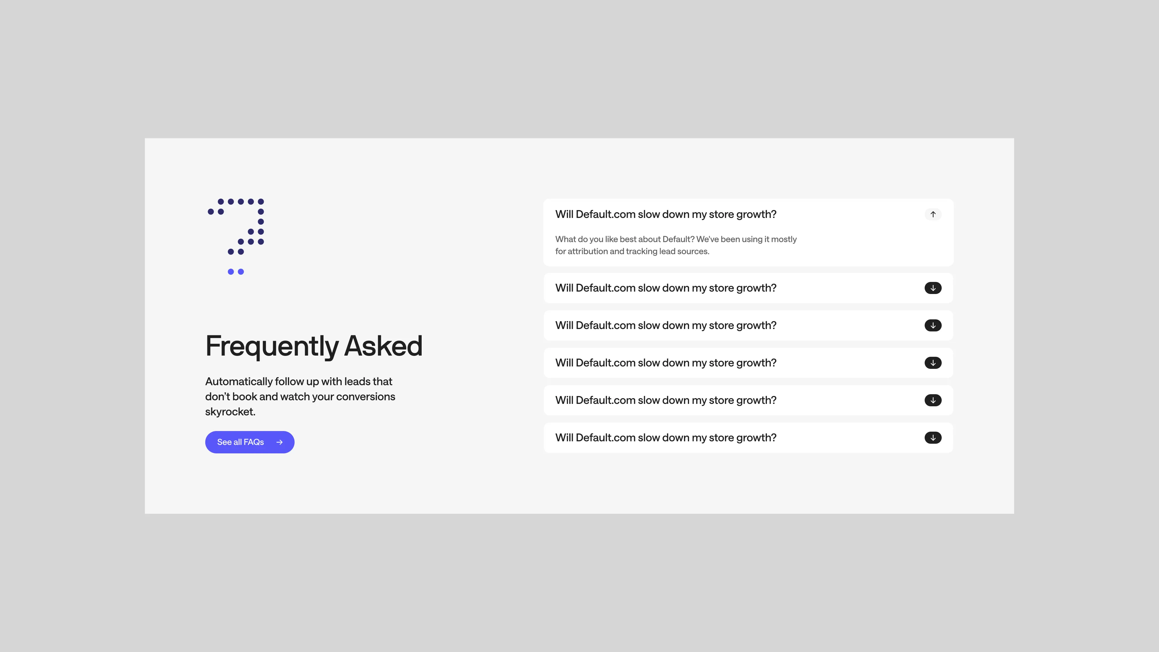
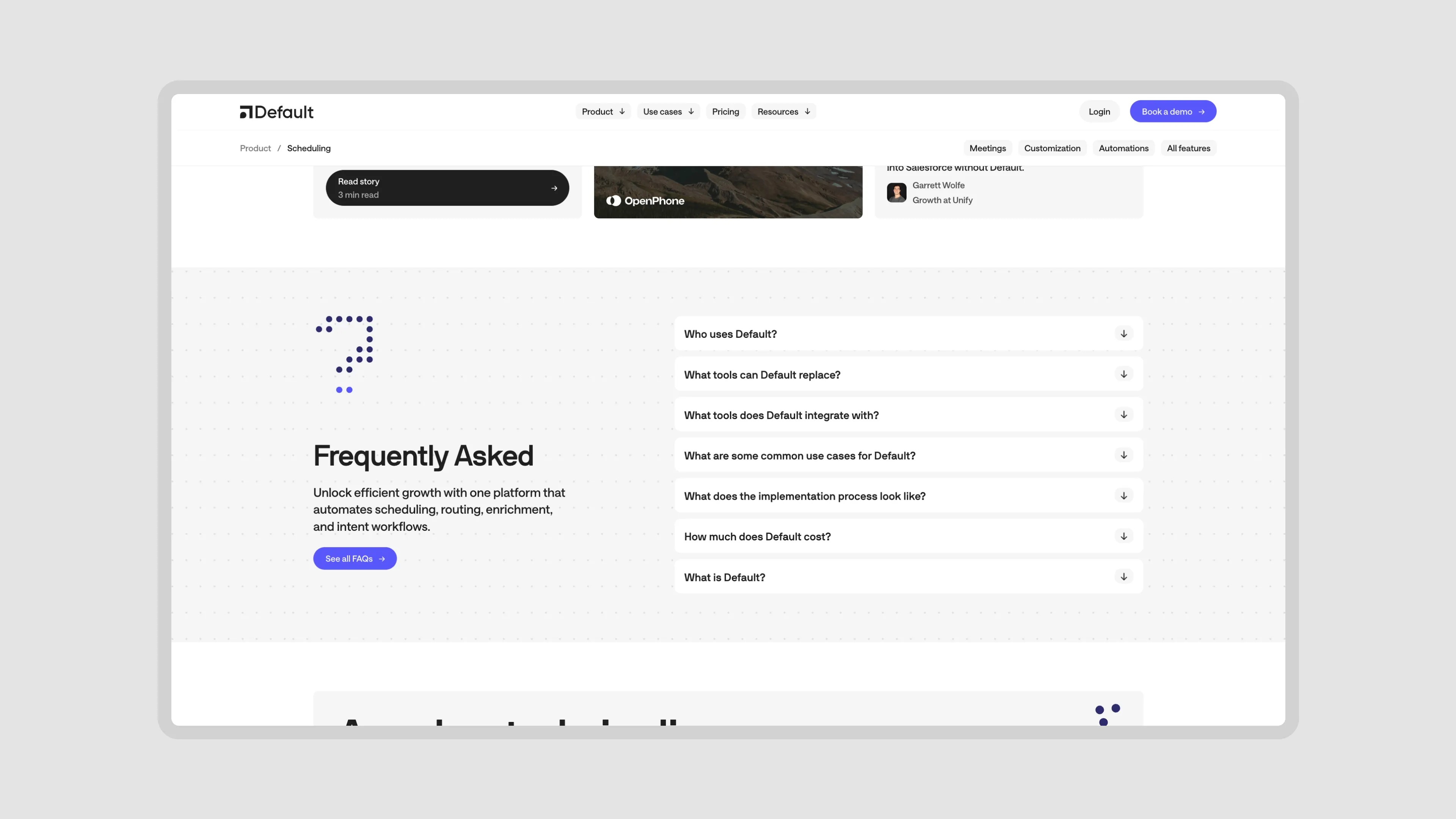
CMS Powered FAQs
Double Navigation on Product / Solution Pages
CMS Powered Feature Grid
Symbol Led, CMS-Powered Callout Block
Rich Text CTAs and Components
I could keep going on about the little details and adjustments we created for Default, but I think this is a good place to kind of wrap things up and just let you browse through everything on the live site.
Final Thoughts
This was a big web project but the real challenge was to get all of those interconnected pieces ready and live at our quality standards ready in such a short period of time.
I’m personally quite stoked with the way things turned out and super glad the Default team trusted our vision + let us do our thing at every step of the way, from designing the sitemap to product UI. They really made things easy for us by giving us freedom to do things the right way.
Working with Hex was an amazing experience! The team moved incredibly fast, and we were able to see the final designs much quicker than expected. The feedback loop was super short, making the whole process seamless and efficient. We leaned on their expert design advice throughout, and in the end, we absolutely loved our website. Highly recommend!
Thanks to both Stan and Nico for being awesome to work with and great partners throughout.
All Deliverables
- Strategy
- Sitemap
- Website Design
- Webflow Project
- Component Library
- CMS System
- Product Design
- Illustration / Iconography
- Webflow Training
- SEO Clean-up
- Webflow Handoff Guide
- UI Design
- Rive Animations
- No-code Integration
- Performance Audits
- Custom CMS Guide
Credits
- Ayush
- Tomasz
- Shais
- Bartek
- Preston
- Tanbir
"Working with HEX was an amazing experience! The team moved incredibly fast, and we were able to see the final designs much quicker than expected.
The feedback loop was super short, making the whole process seamless and efficient. We leaned on their expert design advice throughout, and in the end, we absolutely loved our website. Highly recommend!"
The feedback loop was super short, making the whole process seamless and efficient. We leaned on their expert design advice throughout, and in the end, we absolutely loved our website. Highly recommend!"